Background
Recently, I stumbled upon a post by data visualization designer Cédric Scherer, and I was completely blown away: I could never imagine how amazing ggplots can be (I believe you’ll be in awe of it too)! Inspired by this, I hope to create my own one as well, both for fun and for learning and practicing. In fact, I think this is an excellent opportunity to bring together different data science skills: data scraping, data wrangling, and data visualization, to produce something cool and interesting.
The rocket is about to lift off now. Take a deep breath and we are ready for our space journey!!!
A leg-by-leg journey through the solar system
This is quite a long journey, and so I’ll break it down into several legs so that we can fully explore the great scenery of the outer space along our trip.
Leg 1. Scrape the planetary data
Our first leg is to prepare the planetary data for our figure. We’ll do so by scraping the information from the website and organizing it into a tidy table.
library(tidyverse)
library(rvest)  # for scraping the website
library(janitor)  # for the function "clean_names()"

### Read the website content
html <- read_html("https://www.encyclopedia.com/reference/encyclopedias-almanacs-transcripts-and-maps/major-planets-solar-system-table")

### Extract and organize the table
planetary_dat <- html %>%
  html_element("table") %>%  # find the <table> element in the content
  html_table() %>%  # parse the table into a dataframe
  slice(-c(1, 2, 4)) %>%  # remove row 1, 2, and 4
  select(where(function(x){!is.na(x) %>% any()})) %>%  # remove the columns with NAs
  `colnames<-`(.[1, ]) %>%  # set the first row as the header
  .[-1, ] %>%  # remove the first row
  mutate(across(c(2, 5, 6, 7), as.numeric)) %>%  # convert these columns to numeric
  rowid_to_column(var = "row_id") %>%  # add a row id
  clean_names() %>%  # clean the column names
  mutate(volume_earth_1 = (diameter_earth_1)^3)  # volumes of the planets relative to Earth

head(planetary_dat, 5)
# A tibble: 5 × 9
row_id planet distance_fr…¹ perio…² perio…³ mass_…⁴ diame…⁵ numbe…⁶
<int> <chr> <dbl> <chr> <chr> <dbl> <dbl> <dbl>
1 1 Mercury 0.39 88 days 59 days 0.06 0.38 0
2 2 Venus 0.72 225 da… 243 da… 0.82 0.95 0
3 3 Earth 1 365 da… 24 hou… 1 1 1
4 4 Mars 1.52 687 da… 25 hou… 0.11 0.53 2
5 5 Jupiter 5.2 12 yea… 10 hou… 318. 11.2 63
# … with 1 more variable: volume_earth_1 <dbl>, and abbreviated
# variable names ¹distance_from_the_sun_au, ²period_of_revolution,
# ³period_of_rotation, ⁴mass_earth_1, ⁵diameter_earth_1,
# ⁶number_of_confirmed_satellitesLeg 2. Retrieve the url paths to the planet images
Our next leg is to add the urls of planet images to our planetary
data and create HTML <img> tags for plotting. The
column image_width specifies the sizes of the images that
will show up in the figure later.
library(glue)

### The urls of planet images and HTML <img> tags
planetary_dat <- planetary_dat %>%
  mutate(image_url = c(
    "https://scx2.b-cdn.net/gfx/news/hires/2015/whatsimporta.jpg",
    "https://cdn.britannica.com/86/21186-050-C48F8AA1/radar-clouds-Scientists-surface-Venus-computer-image.jpg",
    "https://cdn.britannica.com/25/160325-050-EB1C8FB7/image-instruments-Earth-satellite-NASA-Suomi-National-2012.jpg",
    "https://mars.nasa.gov/system/content_pages/main_images/256_Webp.net-resizeimage_%284%29.jpg",
    "https://upload.wikimedia.org/wikipedia/commons/c/c1/Jupiter_New_Horizons.jpg",
    "https://cdn.britannica.com/80/145480-050-24BF0658/image-Hubble-Space-Telescope-Saturn-moons-shadow.jpg",
    "https://upload.wikimedia.org/wikipedia/commons/c/c9/Uranus_as_seen_by_NASA%27s_Voyager_2_%28remastered%29_-_JPEG_converted.jpg",
    "https://upload.wikimedia.org/wikipedia/commons/6/63/Neptune_-_Voyager_2_%2829347980845%29_flatten_crop.jpg")) %>%  # the urls of planet images
  mutate(image_width = c(15, 16, 17, 30, 31, 50, 22, 20)) %>%  # image sizes
  mutate(image_tag = glue("<img src='{image_url}' width = '{image_width}'/>"))  # HTML <img> tags
Leg 3. Create a basic polar line-dot chart of planets
The previous two legs were mostly about data preparation, and now we are ready to roll up our sleeves and do some heavy lifting. In our third leg, we will create a polar line-dot chart for the planets, with the length of the curve proportional to the distance of the planet to the Sun, and the size of the point proportional to the volume of the planet.
Here we’ll use the function geom_point_blur() in the
package ggblur to add blurry points, and the functions
lighten() and desaturate() in the package
colorspace to modify the color of the points and lines.
We’ll also extend the lower limit of the x-axis to -1 to create some
extra space at the center of the figure where we will be adding an image
later, and extend the upper limit of the y-axis to 35 to prevent the
longest curve from sticking too close to the origin.
library(ggblur)  # for the function "geom_point_blur()"
library(ggforce)  # for the function "geom_link()"
library(colorspace)  # for the function "lighten()" and "desaturate()"

### A basic polar line-dot chart of planets
P_solar_system <- ggplot() +
  geom_point_blur(data = planetary_dat, aes(x = row_id, y = distance_from_the_sun_au,
                                            color = row_id, color = after_scale(lighten(color, 0.5, space = "HLS")),
                                            size = volume_earth_1, blur_size = volume_earth_1)) +
  geom_link(data = planetary_dat, aes(x = row_id, y = 0, xend = row_id,
                                      yend = distance_from_the_sun_au,
                                      color = row_id, color = after_scale(desaturate(color, 0.3))),
            size = 0.75, n = 300) +
  geom_point(data = planetary_dat, aes(x = row_id, y = distance_from_the_sun_au,
                                       color = row_id, size = volume_earth_1)) +
  scale_x_continuous(limits = c(-1, 8)) +  # extend the lower limit of the x-axis
  scale_y_continuous(limits = c(0, 35)) +  # extend the upper limit of the y-axis
  scale_blur_size_continuous(range = c(5, 20)) +
  guides(color = "none", size = "none", blur_size = "none") +
  coord_polar(theta = "y", clip = "off")

P_solar_system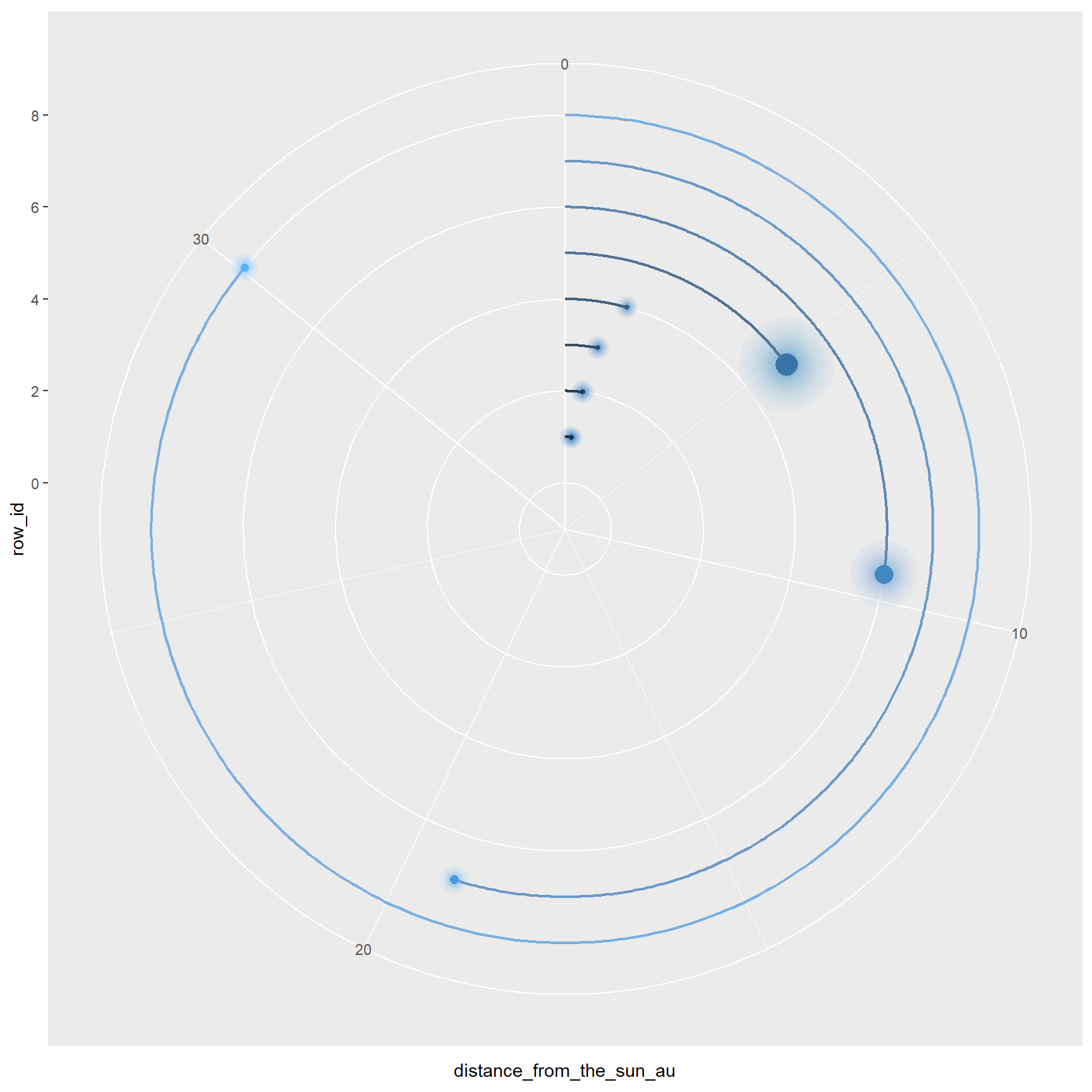
Leg 4. Make the lines and points shine
Our forth leg is to change the appearance of the basic chart we just
made earlier. Specifically, we’ll change the color of the lines and
points using a customized color palette created with the function
tableau_div_gradient_pal() in the package
ggthemes. We’ll then add a vertical line at the origin
using the function geom_link2() in the package
ggforce, which allows for continuous color gradients along
the line. I think this vertical line serves as an anchor for the curves
so that they don’t seem to be floating. Lastly, we’ll set the background
to black.
library(ggthemes)  # for the function "tableau_div_gradient_pal()"

### Create a customized color palette
col_pal <- rev(tableau_div_gradient_pal(palette = "Sunset-Sunrise Diverging")(seq(0, 1, length = 8)))

### Glowing lines and points
P_solar_system <- P_solar_system +
  geom_link2(aes(x = 1:8, y = 0, xend = 2:9, yend = 0, color = 1:8), n = 100) +
  scale_color_gradientn(colors = col_pal) +
  theme_void() +
  theme(plot.background = element_rect(fill = "black"),  # black background
        plot.margin = margin(0, 0, 0, 0))

P_solar_system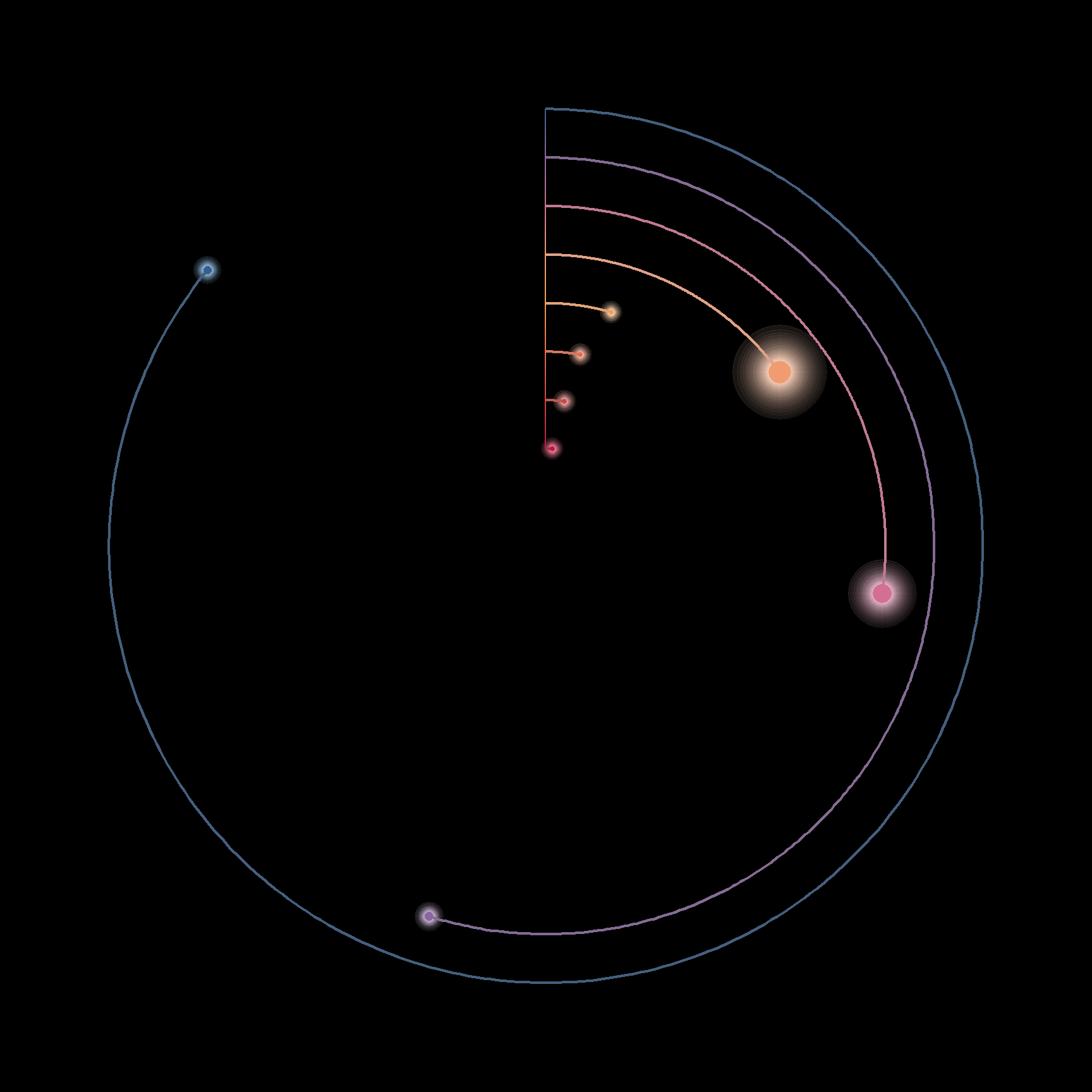
Leg 5. Add the planet images
Leg five is an exciting one: adding the planet images! We’ll achieve
this by mapping the HTML <img> tags we created
earlier in leg two to the figure, using the function
geom_richtext() in the package ggtext. By the
way, ggtext is a super handy package for text manipulations
in ggplots. Check out my previous
post for more details if interested!
Oh, did you notice that the lower left corner of the Saturn image
covered the curve? How can we fix this? Easy-peasy: just move the image
layer to the very bottom! The function move_layers() in the
package gginnards will do the trick.
library(ggtext)

### Add planet images to the figure
P_solar_system <- P_solar_system +
    geom_richtext(data = planetary_dat, aes(x = row_id, y = distance_from_the_sun_au,
                                            label = image_tag),
                  color = NA, fill = NA,
                  nudge_x = c(0, 0, 0, 0, -0.3, -0.2, 0, 0),
                  nudge_y = c(2.4, 1.7, 1.3, 1, 1.4, 1.1, 0.7, 0.6)) +
    geom_richtext(aes(x = -1, y = 0, label = "<img src='https://res.cloudinary.com/dtpgi0zck/image/upload/s--fMAvJ-9u--/c_fit,h_580,w_860/v1/EducationHub/photos/sun-blasts-a-m66-flare.jpg' width='70'/>"),
                  color = NA, fill = NA)

### Move the layer "GeomRichText" to the bottom
library(gginnards)

map_chr(P_solar_system$layers, function(x){class(x$geom)[1]})  # get the layer names
[1] "GeomPointBlur" "GeomPath" "GeomPoint"
[4] "GeomPathInterpolate" "GeomRichText" "GeomRichText" P_solar_system <- move_layers(P_solar_system, "GeomRichText", position = "bottom")
P_solar_system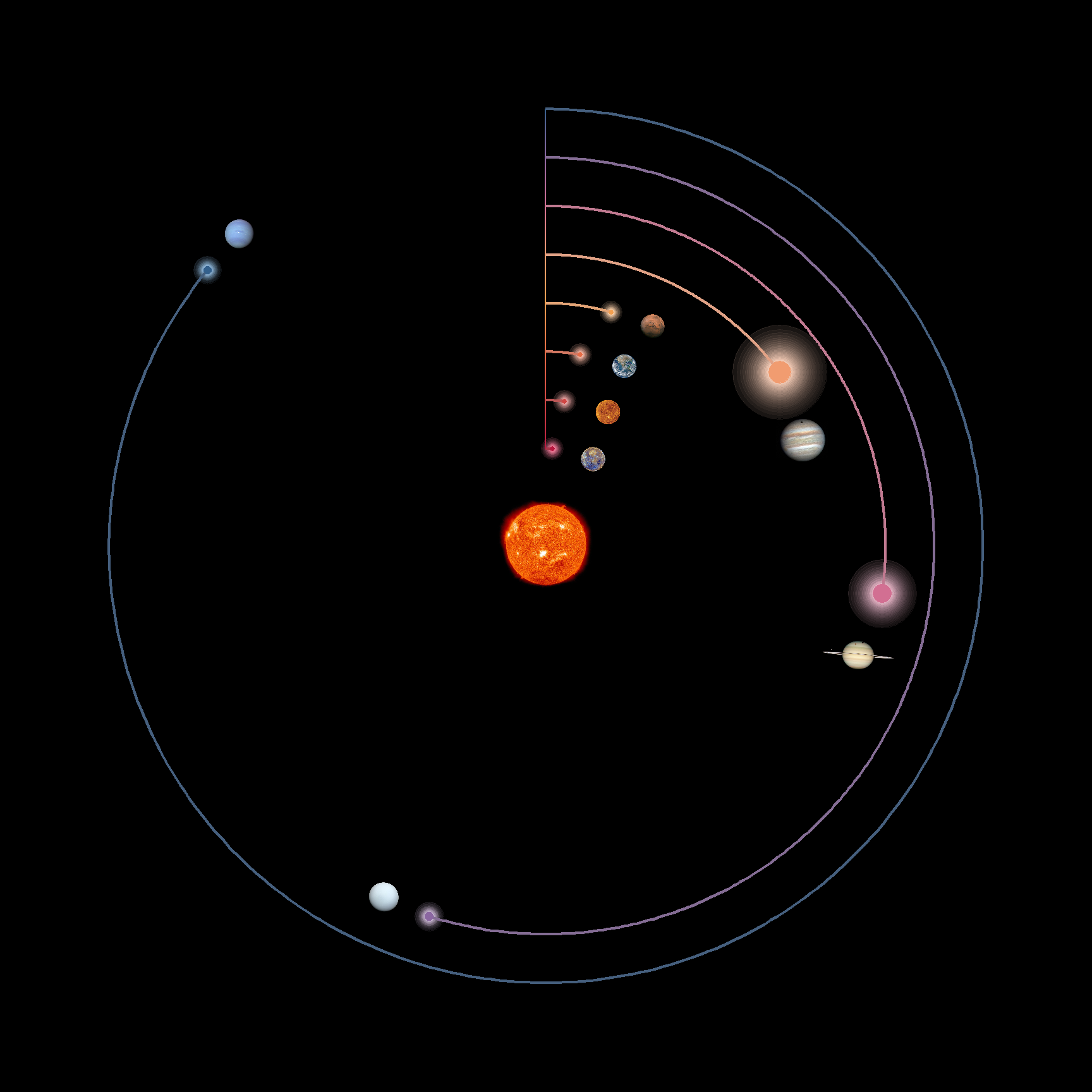
Leg 6. Add a title and planet labels
Our sixth leg is to add a title and planet labels to the figure.
We’ll use geom_text() to map the planet labels to the
desired positions, and again geom_richtext() to add a title
using the HTML syntax.
You might wonder why I padded the planet labels. Actually, when I
just added the labels and set hjust = 1 to adjust their
positions to the left of the vertical line, these labels were
left-shifted but right-aligned (which didn’t look so pleasant in my
opinion; I wanted the labels to be centered!). This is mainly due to the
fact that the labels are of different lengths. Therefore, I used this
padding trick to make the labels extremely long and of similar lengths.
In this way, I don’t have to adjust the positions that much
(hjust = 0.7 would be enough to shift the labels to the
left), and this will largely reduce the right-alignment problem.
After some trial and error, the labels seemed to be fairly centered. Sometimes it does take a while to experiment and fine-tune the values when you adjust the item positions (which could even a bit irritating!). But isn’t this the most fun and fulfilling part of ggplots?!
library(ggtext)

### Pad the planet labels
planetary_dat <- planetary_dat %>%
  mutate(planet_pad = ifelse(nchar(planet)%%2 == 0,
                             str_pad(planet, width = 50, side = "both"),
                             str_pad(planet, width = 51, side = "both")))

### Add a title to the figure
P_solar_system <- P_solar_system +
  geom_text(data = planetary_dat, aes(x = row_id, y = 0, color = row_id,
                                          label = glue("{planet_pad}")),
            size = 2.5, fontface = "bold", hjust = 0.7) +
  geom_richtext(data = planetary_dat, aes(x = 3.3, y = 18.2,
                                          label = "<b><span style = 'font-size:24pt'>A</span>n<span> </span><span style = 'font-size:24pt'>E</span>pic<span> </span><span style = 'font-size:24pt'>J</span>ourney<span> </span>through<span> </span>the<span> </span><span style = 'font-size:24pt'>G</span>lowing<span> </span><span style = 'font-size:24pt'>S</span>olar<span> </span><span style = 'font-size:24pt'>S</span>ystem</b><br>"),
                size = 4.5,
                color = NA,
                fill = NA,
                text.color = "#09bab7",
                family = "Bookman",
                fontface = "bold.italic")

P_solar_system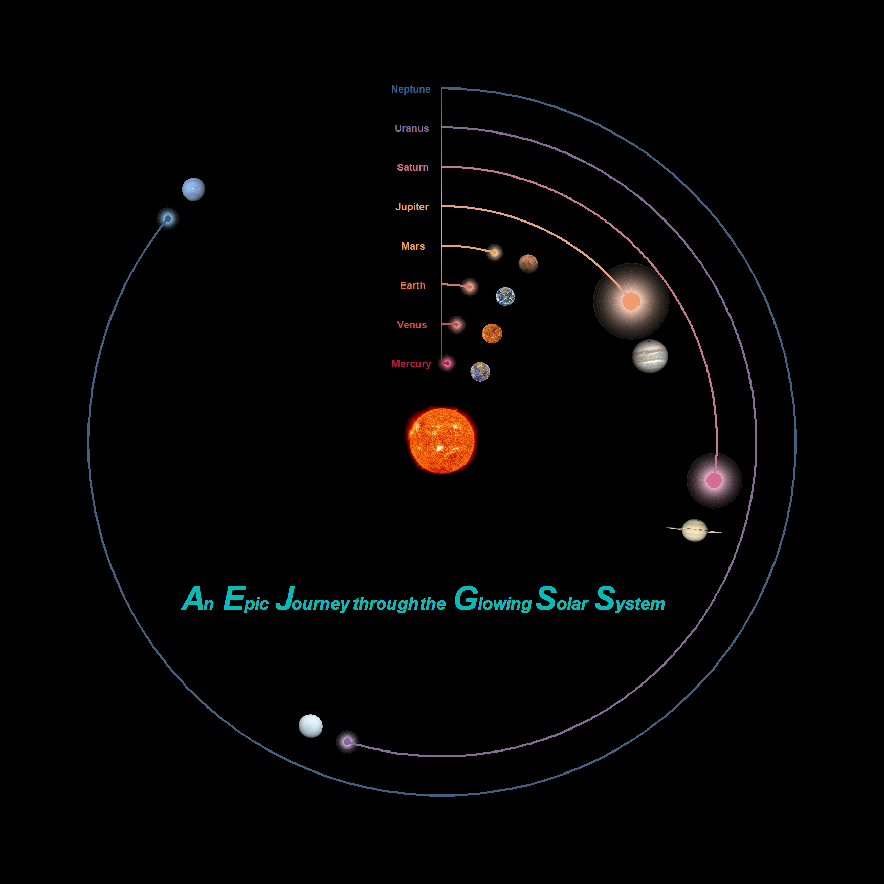
Leg 7. Sprinkle some glittering stars
We’re almost done with our trip! The final leg is to embellish the
figure with some glittering stars. We’ll do this by first creating
another ggplot with random blurry points scattered across a transparent
background, and then overlaying it on the original planet figure using
the functions in the package cowplot.
### Stars of random positions and sizes
set.seed(123)
stars_df <- data.frame(x = runif(50),
                       y = runif(50),
                       size = runif(50))

### The ggplot for the stars
P_stars <- ggplot() +
  geom_point_blur(data = stars_df, aes(x = x, y = y, size = size,
                                       blur_size = size),
                  color = "white", alpha = 0.5, show.legend = F) +
  scale_blur_size_continuous(range = c(0, 2)) +
  scale_size_continuous(range = c(0, 0.35)) +
  theme_void() +
  theme(plot.background = element_rect(fill = "transparent",
                                       color = "transparent"),
        plot.margin = margin(0, 0, 0, 0))

### Overlay the stars on the planet figure
library(cowplot)

P_final <- ggdraw(P_solar_system) +
  draw_plot(P_stars)

P_final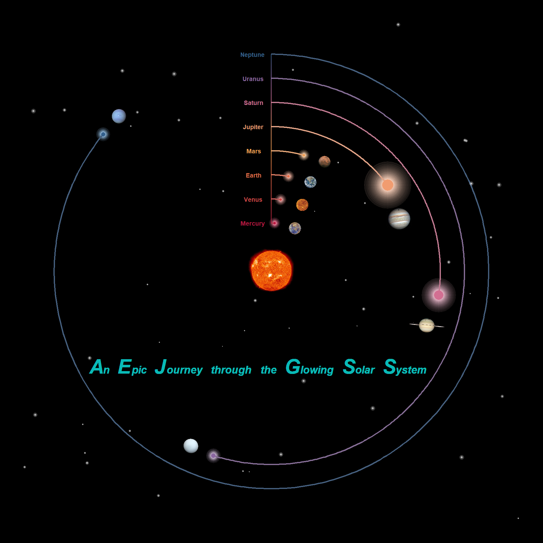
Well done! We make it to the very end. This is absolutely an amazing journey. Unfortunately, our rocket is running out of fuel and so it’s time to go back to Earth. Hope you enjoy this memorable trip and will see you soon next time!
Summary
Hope you learn something useful from this post and don’t forget to leave your comments and suggestions below if you have any!