Overview
Text is one of the fundamental elements in a graph. A well-designed text display can make your plot look pleasant and more informative. ggplot2 provides many functions and arguments for text manipulation (appearance, layout, annotation, etc.), which are already more than enough most of the time. But if you want to do something further, the extension package ggtext has more to offer. This package has several added functionalities currently not implemented in ggplot2, the most important being that it supports the use of Markdown/HTML/CSS, which offers greater flexibility in text rendering. So in this post, I will be showing you some of these cool features. Ready? Let’s get started!
Date preparation
We will be using the data from the International Biology Olympiad website. IBO is arguably the largest annual biology event for high school students. Each year, a member country will host the competition, and students around the world will gather to participate in this great event. Since the very first IBO held in 1990 in the Czech Republic, more countries have joined as members, and it would be interesting to see how the numbers of participating students changed over the past three decades.
To do so, we will first scrap the data from the website using the package rvest, and then do some data manipulation for later plotting use. Since web-scraping is not the main focus of this post, I will not go into the details. If interested, you can visit the package’s website for more information. There are also plenty of learning resources out there on the internet.
library(tidyverse)
library(rvest)

# The website url
IBO_url <- "https://www.ibo-info.org/en/contest/past-ibos.html"

# Read the html and select elements using css selectors
IBO_html <- read_html(IBO_url) %>%
  html_elements("div.item__content") %>%
  html_text2()

# Extract the information from the html text
Year <- IBO_html %>% str_extract("[:digit:]{4}(?=:)")

Country <- IBO_html %>% str_extract("(?<=,\\s)[:alpha:]+[:blank:]*[:alpha:]*") %>%
  replace_na("Japan")

Students <- IBO_html %>% str_extract("[:digit:]*(?=\\s*students)")

# Put all information in a dataframe
IBO_data <- tibble(Year, Country, Students) %>%
  mutate(Year = as.numeric(Year),
         Students = as.numeric(Students)) %>%
  filter(Year %in% 1990:2020)  # Use data only from 1990 to 2020
The basic plot
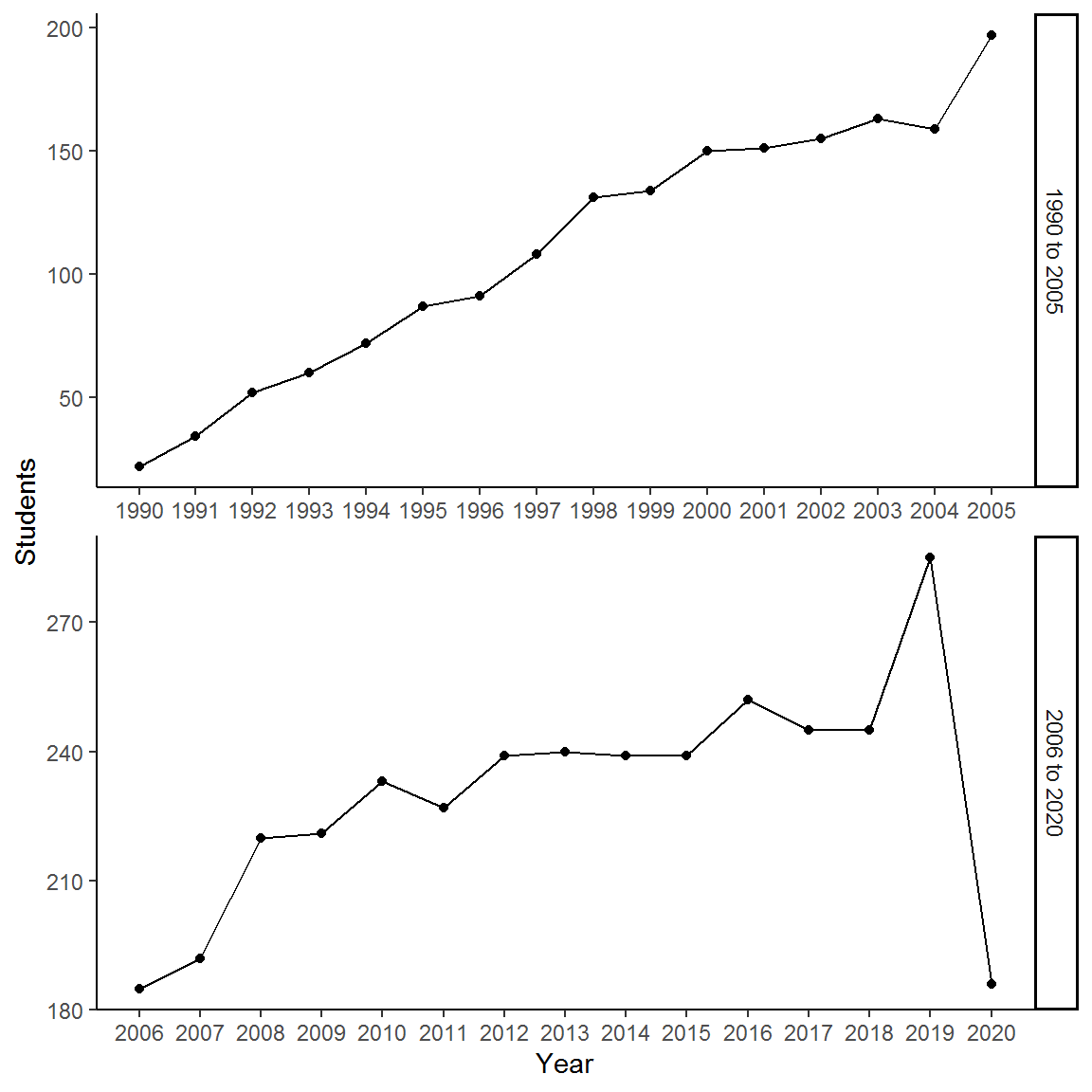
Now we have our dataset at hand. It’s time to visualize it using a simple line chart:
ggplot(IBO_data, aes(x = Year, y = Students)) +
  geom_point() +
  geom_line() +
  labs(y = "Number of participants") +
  theme_classic()

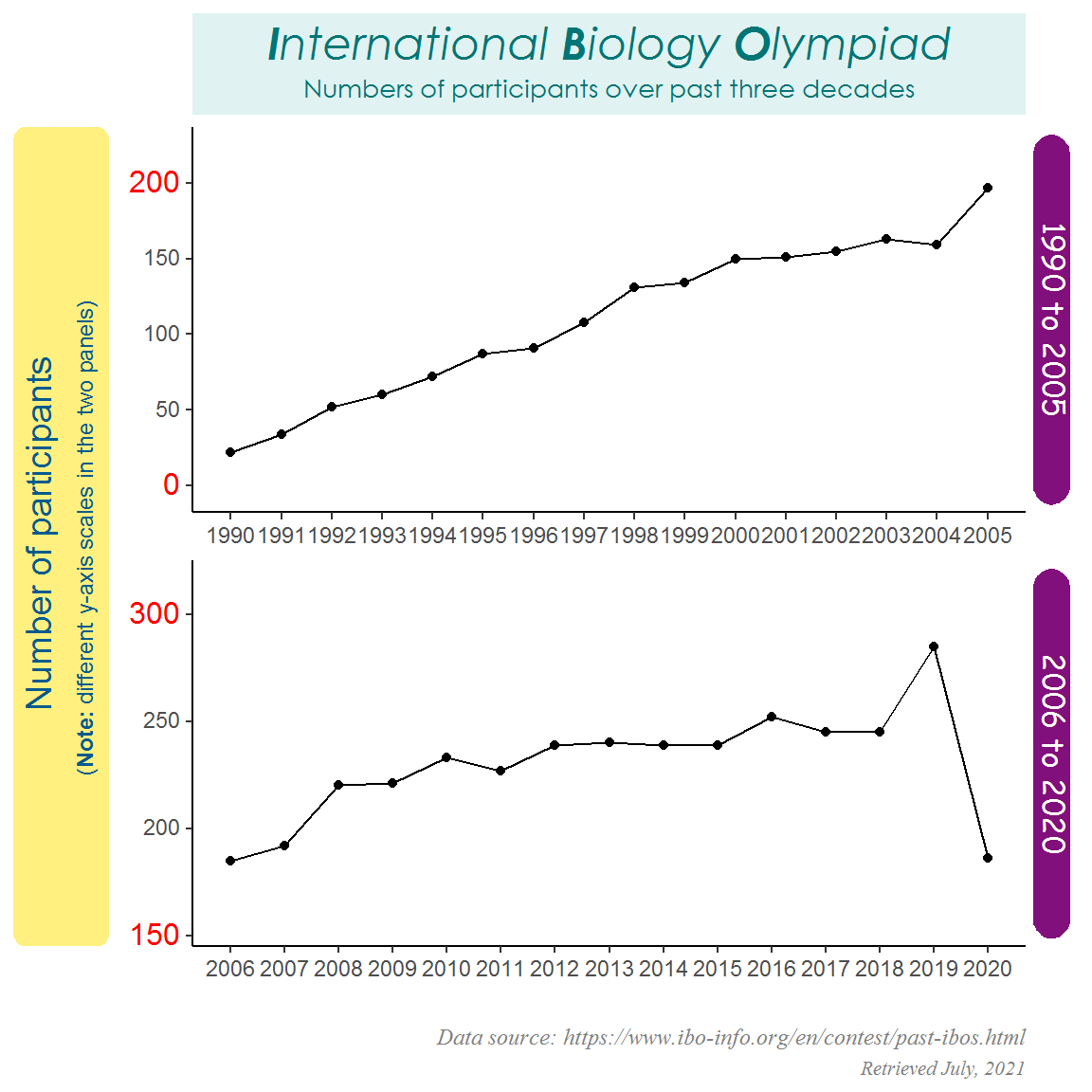
As you can see, the number of participants had generally increased over time, but there was a sharp drop in 2020 due to the COVID-19 global pandemic, which might have caused some countries to withdraw from the event.
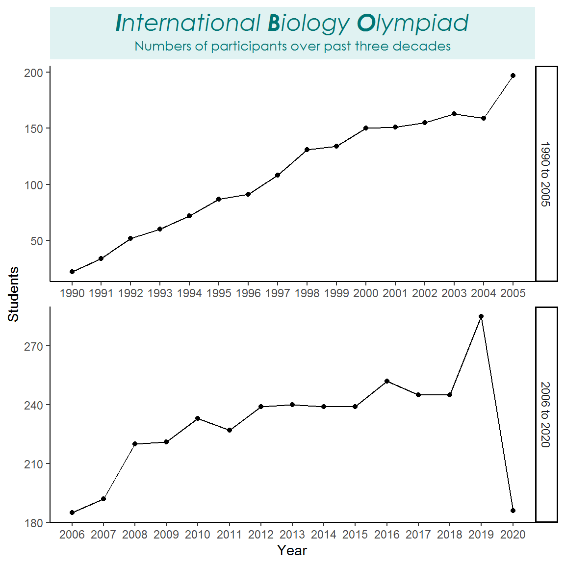
Make it texty
The above line chart looks fine, though a bit plain. So now we will make use of ggtext to add some flavor to it. I will split the line chart into two panels (one from 1990 to 2005 and the other from 2006 to 2020) using facets for two reasons: (1) to avoid crowding and overlapping, and (2) to demonstrate how we can modify the facet strips.
library(ggtext)
library(extrafont) # Fonts for plotting

# Import and register the system fonts
# font_import()  # Please run this line to import the fonts; only need to do it once
loadfonts(quiet = T)  # Need to load the system fonts in every R session

# Create a new column for the two time periods
IBO_data <- IBO_data %>%
  mutate(Time_period = ifelse(Year <= 2005, "1990 to 2005", "2006 to 2020"))

# Plain faceted line chart
IBO_plot <- ggplot(IBO_data, aes(x = Year, y = Students)) +
  geom_point() +
  geom_line() +
  facet_wrap(~Time_period, scales = "free", nrow = 2, strip.position = "right") +
  scale_x_continuous(breaks = 1990:2020) +
  theme_classic()

IBO_plot
There are three main things we can do with ggtext:
(1) Modify text outside the plot area (2) Modify text inside the plot area (3) Add external images to the plot
I will go through the details in the following sections.
(1) Modify text outside the plot area
First, we will begin by modifying the text outside the plot area — title, axis labels, axis ticks, captions, facet strips, etc.
- Title
# Title
IBO_plot <- IBO_plot +
  labs(title = "<span style = 'font-size: 18pt'><i>**I**nternational **B**iology **O**lympiad<i/></span><br>Numbers of participants over past three decades") +
  theme(plot.title = element_textbox_simple(size = 10,
                                            family = "Century Gothic",
                                            color = "#007575",
                                            fill = "#e0f2f2",
                                            halign = 0.5,
                                            lineheight = 1.5,
                                            padding = margin(5, 1, 5, 1),
                                            margin = margin(0, 0, 5, 0)))

IBO_plot
- Axis labels
# Axis labels
IBO_plot <- IBO_plot +
  labs(x = "", y = "Number of participants<br><span style = 'font-size: 9pt;'>(**Note:** different y-axis scales in the two panels)</span>") +
  theme(axis.title.y = element_textbox_simple(size = 14,
                                              family = "Arial",
                                              color = "#045a8d",
                                              fill = "#fff080",
                                              halign = 0.5,
                                              orientation = "left-rotated",
                                              r = unit(5, "pt"),
                                              padding = margin(4, 4, 4, 4),
                                              margin = margin(0, 0, 8, 0),
                                              minwidth = unit(2, "in"),
                                              maxwidth = unit(5, "in")))

IBO_plot

- Axis ticks
# Axis ticks
breaks_fun <- function(x) {  # A function to specify the axis tick positions for the two panels
  if (min(x) < 50) {
    seq(0, 200, 50)
  } else {
    seq(150, 300, 50)
  }
}

labels_fun <- function(x) {  # A function to specify the axis tick labels for the two panels
  if (min(x) < 50) {
    c("<span style = 'font-size: 12pt; color: red;'>0</span>", seq(50, 150, 50), "<span style = 'font-size: 12pt; color: red;'>200</span>")
  } else {
    c("<span style = 'font-size: 12pt; color: red;'>150</span>", seq(200, 250, 50), "<span style = 'font-size: 12pt; color: red;'>300</span>")
  }
}

IBO_plot <- IBO_plot +
  scale_y_continuous(expand = c(0, 40),  # For adjusting the y-axis range
                     breaks = breaks_fun,
                     labels = labels_fun) +
  theme(axis.text.y = element_markdown())

IBO_plot
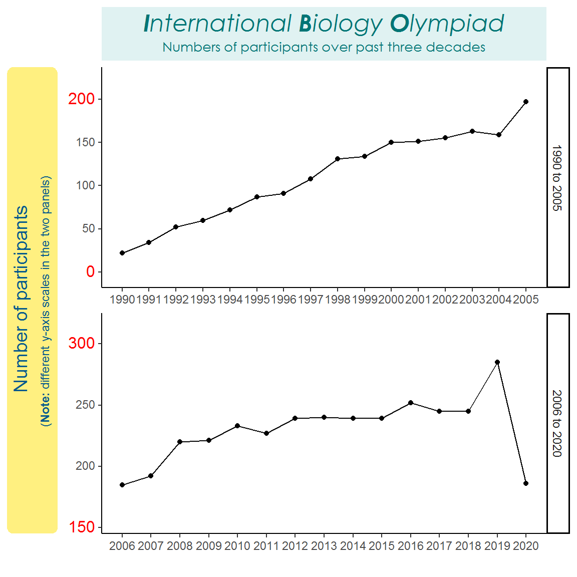
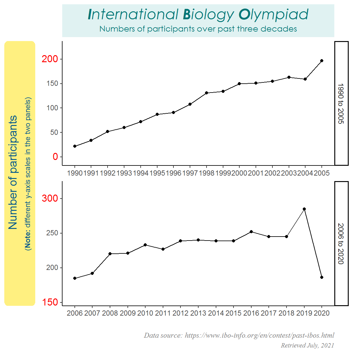
- Caption
# Caption
IBO_plot <- IBO_plot +
labs(caption = "<i><span style = 'font-size: 9pt;'>Data source: https://www.ibo-info.org/en/contest/past-ibos.html</span><br>Retrieved July, 2021<i/>") +
theme(plot.caption = element_markdown(size = 8,
family = "serif",
color = "grey50",
lineheight = 1.5))
IBO_plot
- Facet strips
# Facet strips
IBO_plot <- IBO_plot +
  theme(strip.background = element_blank(),
        strip.text.y = element_textbox_simple(size = 12,
                                              family = "Comic Sans MS",
                                              color = "white",
                                              fill = "#810f7c",
                                              halign = 0.5,
                                              orientation = "right-rotated",
                                              r = unit(8, "pt"),
                                              padding = margin(1, 1, 1, 1),
                                              margin = margin(3, 3, 3, 3)))

IBO_plot
The key functions here are element_textbox_simple() and element_markdown(). Basically they do the same job; the main difference is that the former allows for more control over the appearance of the text box, whereas the latter focuses on modifying the text itself. So if you are working with text only, you can simply use element_markdown().
There are many things you can modify for the text. For example, the font size, font family, font color, font position and alignment, and line spacing. As for the text box, you can change the border color, fill color, size, corner radius (for rounded box), and so on. Take a look at the documentations of the two functions to see what other arguments there are!
The usage of element_textbox_simple() and element_markdown() are pretty much similar to their ggplot2 counterpart element_text(). When you want to modify a specific part of the plot (e.g., title), just call these functions to the corresponding arguments (e.g., plot.title =) in the theme().
Also, you might have seen that I use quite a bit of the Markdown/HTML/CSS syntaxes. Remember in the beginning, I mentioned that ggtext can render text written in Markdown/HTML/CSS languages. With these, you can easily do some advanced text manipulation, for instance, modifying the appearance of a specific letter/word in a sentence (like what I did for the title).
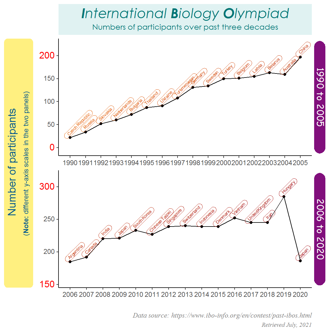
(2) Modify text inside the plot area
After getting the text outside the plot area done, we can proceed to the text inside the plot area. Specifically, I will add country labels to the points and modify their appearances a bit.
Here I use the function geom_richtext() to map the country labels to the points. This function is quite similar to ggplot2’s geom_text() or geom_label(), but it has an additional feature: the text/box can be rotated by any angles.
# Add country labels to the points
IBO_plot <- IBO_plot +
  geom_richtext(aes(label = Country),
                size = 2,
                color = colorRampPalette(c("#a50f15", "#e66101"))(nrow( IBO_data)),
                fill = "transparent",
                angle = 45,
                hjust = 0.1,
                vjust = -0.1,
                label.r = unit(4, "pt"),
                label.padding = unit(c(1, 5, 1, 5), "pt"))

IBO_plot
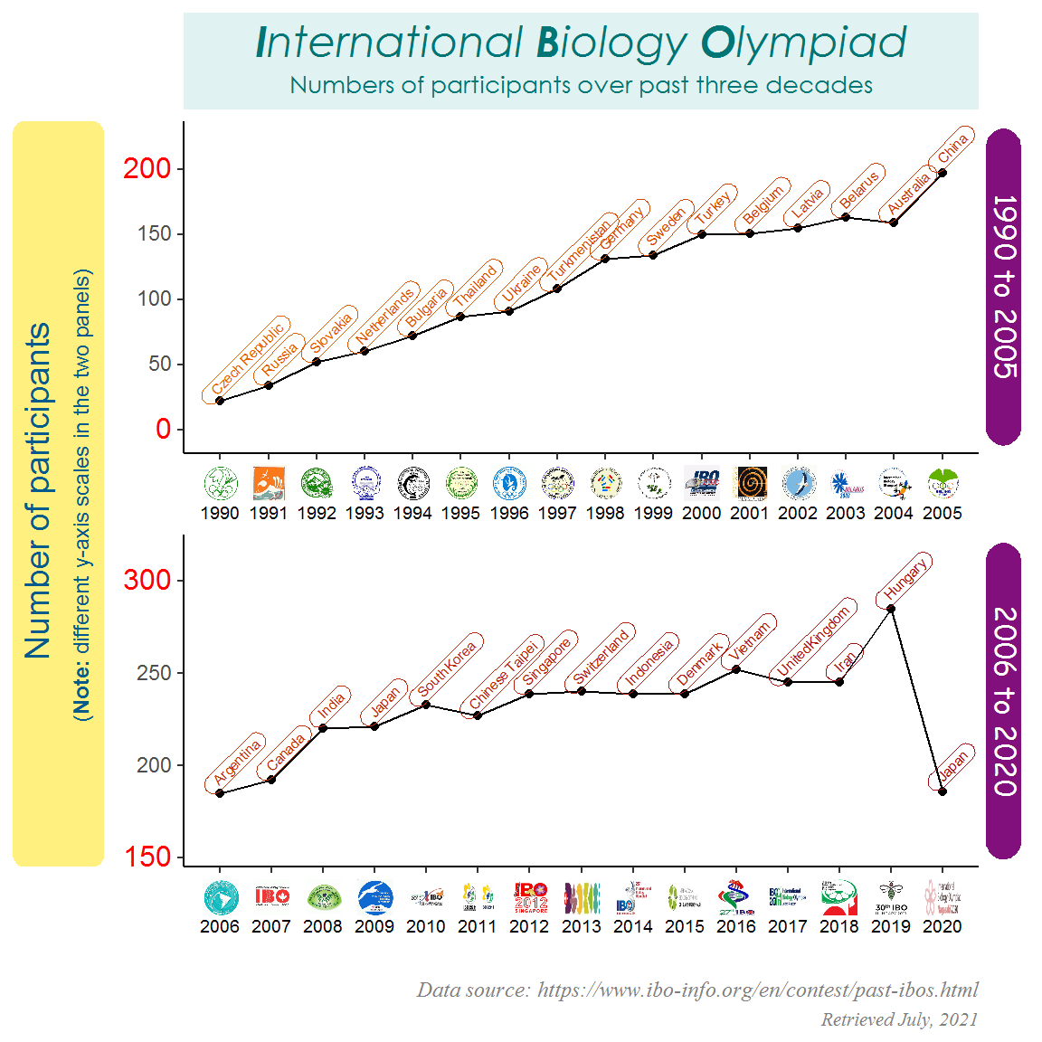
(3) Add external images to the plot
Now we are finished with our text manipulation. Most of the time, we will end it here and be happy to go. However, there is one extra thing we can do to make the plot fancier — adding external images to the plot! Of course you can do this manually later (perhaps in PowerPoint), but isn’t it great to complete all the work at once in R? This will streamline the process and make it fully reproducible! So let’s do it!
The principle of adding images is the use of HTML <img> tag, which has a basic syntax structure <img scr = 'path_to_image'/>. If you are not familiar with HTML, don’t panic. Simply copy and paste the code in the example below and replace the image path with yours (can be a website url or a local directory). The additional height and width attribute in the <img> tag allow for controlling the size of the images.
You can add images to two places of a figure: axis ticks and plot panel.
- Add images to the axis ticks
To add images to the axis ticks, you need to specify in scale_x|y_XXX() the tick positions at which the images should be placed on the axis (breaks =), along with the HTML <img> tags as labels (labels =). After that, call element_markdown() to the corresponding theme element (in this example axis.text.x =) in theme(). The images will then be displayed along the axis.
# Download the zip file of the logos from my GitHub repository
# The file will be saved in your current directory
download.file(url = "https://raw.githubusercontent.com/GenChangHSU/ggGallery/master/_posts/2021-07-10-post-5-awesome-text-display-with-ggtext/IBO_logos.zip", destfile = "./IBO_logos.zip")

# Unzip the file
unzip(zipfile = "./IBO_logos.zip")

# HTML <img> tags
IBO_logo <- paste0("<img src = './IBO_logos/", 1990:2020, ".png' height = '15' width = '15' /><br>", 1990:2020)

# Add the logos to the x-axis ticks
IBO_plot <- IBO_plot +
  scale_x_continuous(breaks = 1990:2020, labels = IBO_logo) +
  theme(axis.text.x = element_markdown(color = "black", size = 7))

IBO_plot
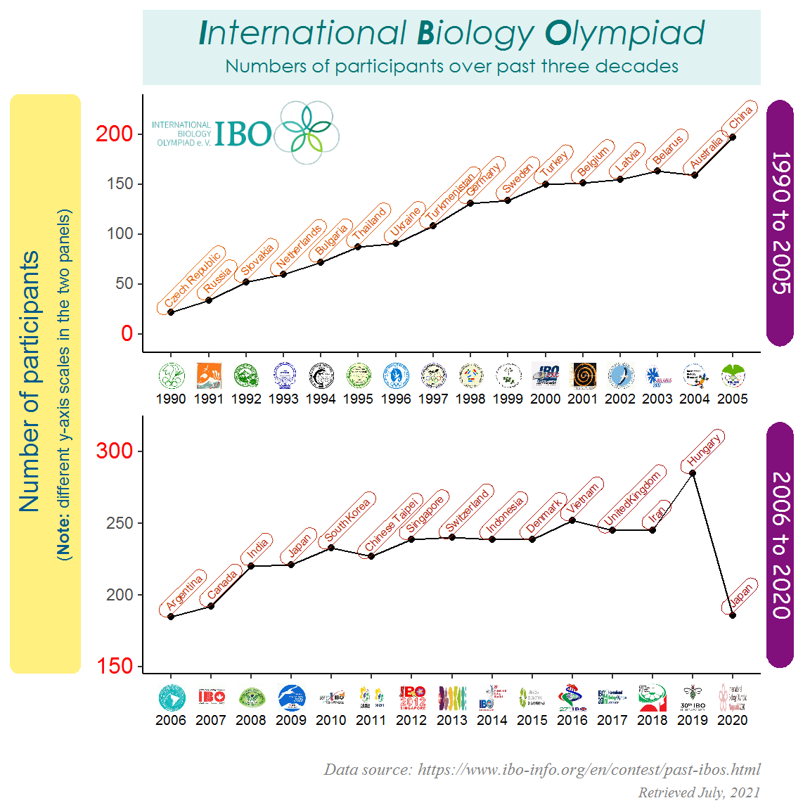
- Add images to the plot panel
To add images to the plot panel, simply create a dataframe containing the x and y positions as well as a column containing the HTML <img> tags, and use geom_richtext(aes(label = )) to map the image tags to the plot. The images will then be displayed at the designated positions.
# Add the main logo to the upper panel
IBO_logo_df <- data.frame(x = 1992,
                          y = 200,
                          Time_period = "1990 to 2005",
                          logo = paste0("<img src = './IBO_logos/main.png' width = '100' />"))

IBO_plot <- IBO_plot +
  geom_richtext(data = IBO_logo_df,
                aes(x = x, y = y, label = logo),
                colour = "transparent")

IBO_plot
To give you a better idea of how the final figure is generated, I have organized the code chunk pieces throughout the post into a full code chunk below. You can simply copy and paste it into your R session, swap your own data and modify the arguments as you wish!
# Library
library(tidyverse)
library(rvest)
library(ggtext)
library(extrafont)
# Import and register the system fonts
# font_import() # Please run this line to import the fonts; only need to do it once
loadfonts(quiet = T) # Need to load the system fonts in every R session
# The IBO website url
IBO_url <- "https://www.ibo-info.org/en/contest/past-ibos.html"
# Read and extract the website contents into a dataframe
IBO_html <- read_html(IBO_url) %>%
html_elements("div.item__content") %>%
html_text2()
Year <- IBO_html %>% str_extract("[:digit:]{4}(?=:)")
Country <- IBO_html %>% str_extract("(?<=,\\s)[:alpha:]+[:blank:]*[:alpha:]*") %>% replace_na("Japan")
Students <- IBO_html %>% str_extract("[:digit:]*(?=\\s*students)")
IBO_data <- tibble(Year, Country, Students) %>%
mutate(Year = as.numeric(Year),
Students = as.numeric(Students)) %>%
filter(Year %in% 1990:2020) %>%
mutate(Time_period = ifelse(Year <= 2005, "1990 to 2005", "2006 to 2020"))
# Functions for setting breaks and labels for each of the two facet panels
breaks_fun <- function(x) {
if (min(x) < 50) {
seq(0, 200, 50)
} else {
seq(150, 300, 50)
}
}
labels_fun <- function(x) {
if (min(x) < 50) {
c("<span style = 'font-size: 12pt; color: red;'>0</span>", seq(50, 150, 50), "<span style = 'font-size: 12pt; color: red;'>200</span>")
} else {
c("<span style = 'font-size: 12pt; color: red;'>150</span>", seq(200, 250, 50), "<span style = 'font-size: 12pt; color: red;'>300</span>")
}
}
# Download the IBO logos
download.file(url = "https://raw.githubusercontent.com/GenChangHSU/ggGallery/master/_posts/2021-07-10-post-5-awesome-text-display-with-ggtext/IBO_logos.zip", destfile = "./IBO_logos.zip")
unzip(zipfile = "./IBO_logos.zip")
# A vector of HTML <img> tags as x-axis tick logos
IBO_logo <- paste0("<img src = './IBO_logos/", 1990:2020, ".png' height = '15' width = '15' /><br>", 1990:2020)
# A dataframe for the main logo
IBO_logo_df <- data.frame(x = 1992,
y = 200,
Time_period = "1990 to 2005",
logo = paste0("<img src = './IBO_logos/main.png' width = '100' />"))
# Plot
ggplot(IBO_data, aes(x = Year, y = Students)) +
# Country labels
geom_richtext(aes(label = Country),
size = 2,
color = colorRampPalette(c("#a50f15", "#e66101"))(nrow( IBO_data)),
fill = "transparent",
angle = 45,
hjust = 0.1,
vjust = -0.1,
label.r = unit(4, "pt"),
label.padding = unit(c(1, 5, 1, 5), "pt")) +
# Main logo in the upper panel
geom_richtext(data = IBO_logo_df,
aes(x = x, y = y, label = logo),
colour = "transparent") +
# Points
geom_point() +
# Lines
geom_line() +
# Facets
facet_wrap(~Time_period, scales = "free", nrow = 2, strip.position = "right") +
# x-axis tick logos
scale_x_continuous(breaks = 1990:2020, labels = IBO_logo) +
# y-axis tick labels
scale_y_continuous(expand = c(0, 40),
breaks = breaks_fun,
labels = labels_fun) +
# Built-in theme
theme_classic() +
# Specify title, y-axis label, caption, and facet strips using Markdown/HTML/CSS language
labs(title = "<span style = 'font-size: 18pt'><i>**I**nternational **B**iology **O**lympiad<i/></span><br>Numbers of participants over past three decades",
x = "",
y = "Number of participants<br><span style = 'font-size: 9pt;'>(**Note:** different y-axis scales in the two panels)</span>",
caption = "<i><span style = 'font-size: 9pt;'>Data source: https://www.ibo-info.org/en/contest/past-ibos.html</span><br>Retrieved July, 2021<i/>") +
theme(# Title
plot.title = element_textbox_simple(size = 10,
family = "Century Gothic",
color = "#007575",
fill = "#e0f2f2",
halign = 0.5,
lineheight = 1.5,
padding = margin(5, 1, 5, 1),
margin = margin(0, 0, 5, 0)),
# y-axis label
axis.title.y = element_textbox_simple(size = 14,
family = "Arial",
color = "#045a8d",
fill = "#fff080",
halign = 0.5,
orientation = "left-rotated",
r = unit(5, "pt"),
padding = margin(4, 4, 4, 4),
margin = margin(0, 0, 8, 0),
minwidth = unit(2, "in"),
maxwidth = unit(5, "in")),
# x-axis tick logos
axis.text.x = element_markdown(color = "black", size = 7),
# y-axis tick labels
axis.text.y = element_markdown(),
# Caption
plot.caption = element_markdown(size = 8,
family = "serif",
color = "grey50",
lineheight = 1.5),
# Facet strips
strip.background = element_blank(),
strip.text.y = element_textbox_simple(size = 12,
family = "Comic Sans MS",
color = "white",
fill = "#810f7c",
halign = 0.5,
orientation = "right-rotated",
r = unit(8, "pt"),
padding = margin(1, 1, 1, 1),
margin = margin(3, 3, 3, 3)))
Summary
A quick recap of what we have done throughout the post. First, we modified the plot title, axis labels, axis ticks, caption, and facet strips using two theme() elements element_textbox_simple() and element_markdown(). Second, we added some country labels to the points using the geom layer geom_richtext() and customized the labels a bit. Third, we used element_markdown() to add external images to the x-axis, and geom_richtext() to add another image to the plot panel.
Honestly, I feel that the final figure in this post does not look so satisfying. I tried to show the things you can do with ggtext as many as possible, making the figure kind of “over-texty”. It is just for demonstration purpose though. When working with your own figure, you might want to think a bit about how to better design it. Maybe spend some time exploring the package website to learn more. Also, I highly recommend having a basic understanding of Markdown/HTML/CSS, which will allow you to fully leverage the strength of ggtext!
Oh, one last thing forget to say: I was one of the participants in the 2014 IBO in Bali, Indonesia. It’s been seven years. Time flies! In fact, this is one of the main reasons why I chose IBO data as the example dataset. The other is that the website has many logos, which serves well the purpose of this post.
That’s it for this post and don’t forget to leave your comments and suggestions below if you have any!