Introduction
Alluvial diagrams are a type of chart that shows the relationships between categorical variables for a given quantity (number of people, amount of energy, etc.) They look like a stacked barplot with flow streams connecting the stacks of adjacent bars (that’s why it gets its name!). These diagrams are useful for visualizing pathways and trends across variables. Another similar chart is bump charts, which emphasize the change in rankings of multiple objects over time.
Create alluvial
diagrams with ggalluvial
We’ll be using the extension package ggalluvial
to create alluvial diagrams in ggplot. The functions in
ggalluvial can take data in both wide and long format, and
we’ll start with the wide format here.
Working with wide format data
First, let’s prepare our example data using the diamonds
dataset: We’ll classify the carat of the diamonds into “Large” and
“Small” as well as the price into “Low”, “Mid”, and “High”, and then
tally the numbers of diamonds by carat, cut, and price.
library(tidyverse)

# Prepare wide format diamonds data
diamonds_wide <- diamonds %>%
  mutate(price_cat = case_when(price < quantile(price, 0.33) ~ "Low",
                               price > quantile(price, 0.67) ~ "High",
                               TRUE ~ "Mid"),
         price_cat = factor(price_cat, levels = c("High", "Mid", "Low")),
         carat_cat = ifelse(carat > median(carat), "Large", "Small"),
         cut = fct_rev(cut)) %>%
  group_by(carat_cat, cut, price_cat) %>%
  summarise(count = n()) %>%
  ungroup()

head(diamonds_wide)
# A tibble: 6 × 4
carat_cat cut price_cat count
<chr> <ord> <fct> <int>
1 Large Ideal High 5808
2 Large Ideal Mid 2648
3 Large Premium High 5649
4 Large Premium Mid 2283
5 Large Premium Low 2
6 Large Very Good High 4135Now having the appropriate data on hand, we can visualize the relationships between carat, cut, and price in an alluvial diagram. There are a few things worth noting in the below code chunk:
The flow
streams and bars are drawn using geom_alluvium() and
geom_stratum(), respectively
The bars are
positioned along the horizontal axis using the arguments
aes(axis1 = carat_cat, axis2 = cut, axis3 = price_cat)
The function
geom_stratum() will create a new internal variable
“stratum” that can be used to label the bars via the
argument aes(label = after_stat(stratum))
The flow streams are colored by price
# install.packages("ggalluvial")  # install the package if you haven't
library(ggalluvial)
library(scales)  # for the function "comma_format()"

ggplot(diamonds_wide, aes(axis1 = carat_cat, axis2 = cut, axis3 = price_cat, y = count)) +
  geom_alluvium(aes(fill = price_cat), width = 1/5) +
  geom_stratum(width = 1/5, fill = "#fee6ce", color = "grey30") +
  geom_text(stat = "stratum", aes(label = after_stat(stratum)), size = 2.5) +
  scale_x_discrete(limits = c("Carat", "Cut", "Price"), expand = c(0, 0.2)) +
  scale_y_continuous(expand = c(0, 0), labels = comma_format()) +
  labs(y = "Count") +
  scale_fill_brewer(name = "Price", palette = "Set1") +
  theme_classic(base_size = 13) +
  theme(axis.line.x = element_blank(),
        axis.ticks.x = element_blank())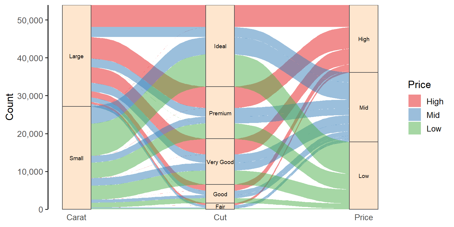
It seems that no large diamond has a low price and no small diamond has a high price, regardless of the cut quality.
From this plot, we can further produce the so-called “parallel sets” by adjusting the width of the bars, the knot position (the inflection point) of the flow streams, and the orientation of the diagram:
ggplot(diamonds_wide, aes(axis1 = carat_cat, axis2 = cut, axis3 = price_cat, y = count)) +
  geom_alluvium(aes(fill = price_cat), width = 0, knot.pos = 0, show.legend = F) +  # knot.pos = 0 generates straight flow streams
  geom_stratum(width = 0.02, fill = "black", color = "white") +  # reduce the bar width to create thick lines
  geom_text(stat = "stratum", aes(label = after_stat(stratum)), size = 2.5, nudge_x = 0.05) +
  scale_x_discrete(limits = c("Carat", "Cut", "Price"), expand = c(0, 0.1)) +
  scale_y_continuous(expand = c(0, 0), labels = comma_format()) +
  labs(y = "Count") +
  scale_fill_brewer(palette = "Set1") +
  coord_flip() +  # change the orientation of the diagram
  theme_classic(base_size = 13) +
  theme(axis.line.y = element_blank(),
        axis.ticks.y = element_blank())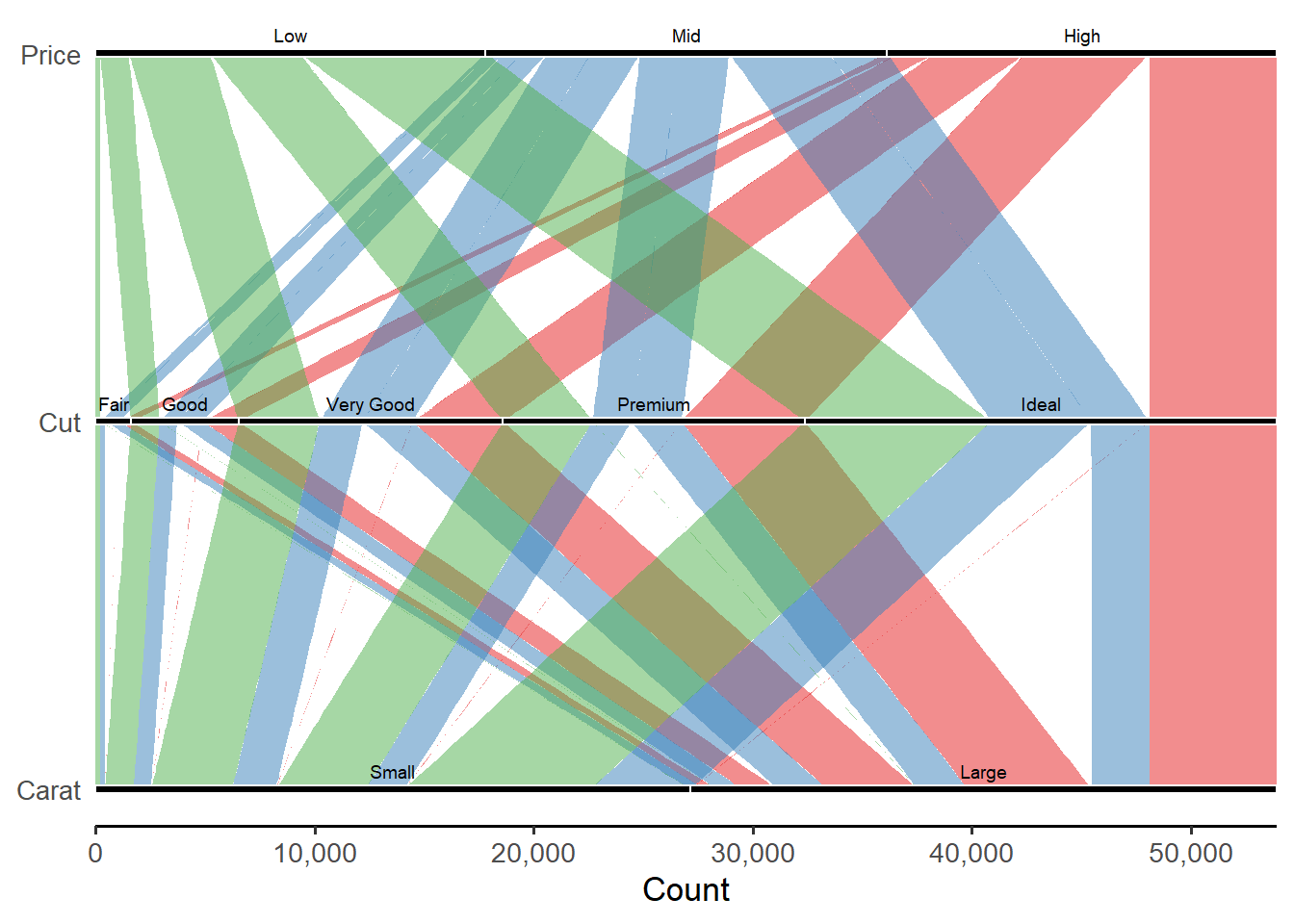
Working with long format data
As mentioned earlier, ggalluvial also works with data in
long format. So let’s convert the data now. Note that we need to add an
ID column to the dataframe before melting it into long format. These
ID’s will tell the functions how to connect the flows between adjacent
bars (each ID represents a flow stream across all the bars from left to
right).
# Convert the wide data into long format
diamonds_long <- diamonds_wide %>%
  mutate(alluvium_ID = row_number()) %>%  # add an ID for each row
  pivot_longer(cols = -c(count, alluvium_ID), names_to = "variable", values_to = "level") %>%
  mutate(level = factor(level, levels = c("Large", "Small", "Ideal", "Premium", "Very Good", "Good", "Fair", "High", "Mid", "Low")))  # adjust the level order for later plotting

head(diamonds_long)
# A tibble: 6 × 4
count alluvium_ID variable level
<int> <int> <chr> <fct>
1 5808 1 carat_cat Large
2 5808 1 cut Ideal
3 5808 1 price_cat High
4 2648 2 carat_cat Large
5 2648 2 cut Ideal
6 2648 2 price_cat Mid Great. It’s time to make the diagram! As the data are now in long format, the argument specifications are a bit different from those we used for previous plots:
The flow
streams are drawn using geom_flow() instead of
geom_alluvium(), and the alluvium ID’s are specified via
the argument aes(alluvium = alluvium_ID)
The positions
of the bars along the x-axis are specified via
aes(x = variable), and the stacks of the bars are specified
via aes(stratum = level)
The bars are
labeled directly via the argument aes(label = ) without
having to call after_stat()
# Create a color palette for the bars
color_pal <- set_names(c("#bdbdbd", "#525252", "#fde725", "#7ad151", "#22a884", "#2a788e", "#414487", "#e41a1c", "#377eb8", "#4daf4a"), nm = levels(diamonds_long$level))

ggplot(diamonds_long, aes(x = variable, y = count, stratum = level, alluvium = alluvium_ID)) +
  geom_flow(aes(fill = level), width = 1/5) +
  geom_stratum(aes(fill = level), alpha = 0.75, width = 1/5) +
  geom_text(stat = "stratum", aes(label = level), size = 3) +
  scale_x_discrete(labels = c("Carat", "Cut", "Price"), expand = c(0, 0.2)) +
  scale_y_continuous(expand = c(0, 0), labels = comma_format()) +
  labs(x = "", y = "Count") +
  guides(fill = "none") +
  scale_fill_manual(values = color_pal) +
  theme_classic(base_size = 13) +
  theme(axis.line.x = element_blank(),
        axis.ticks.x = element_blank())
Do you notice the difference from the previous alluvial diagrams created with wide format data? You’re right! The bars and flows have their own colors now! With this method, we are able to color the bars and the flows between adjacent bars by their corresponding levels (the flow color will be the same as that of the bar stack where the flow originates).
Summary
To recap what we’ve done in this post, we started by creating a
standard alluvial diagram with wide format diamonds data
using the package ggalluvial. We then modified the diagram
to produce parallel sets. Finally, we converted the data into long
format and created another alluvial diagram that had different bar and
flow colors.
As mentioned in the beginning, alluvial diagrams are best for visualizing the relationships between categorical variables. And if the bars along the axis are ordered by time, distance, or some kind of factor gradients, then they can help reveal trends.
Hope you learn something useful from this post and don’t forget to leave your comments and suggestions below if you have any!