Introduction
Bump charts are a special type of line charts that visualize the rankings of multiple objects over time. These charts are especially useful for comparing and highlighting trends. Honestly, I haven’t really heard of this kind of charts before until recently I came across a Tweet about creating bump charts using ggplot. I then took a deeper dive into it and felt that this would certainly make an interesting blog topic. Also, I believe the charts will come in handy someday in the future, both for myself and for the readers like you!
So without further ado, let’s jump right in!
Prepare the data
As mentioned earlier, bump charts are useful for visualizing rankings of items over time. Instead of using a built-in R dataset, this time I’ll prepare my own one, which focuses on the rankings of five ecological journals (Journal of Ecology, Journal of Animal Ecology, Journal of Applied Ecology, Functional Ecology, and Methods in Ecology and Evolution) from the British Ecological Society. Specifically, I would like to see how the rankings of these five journals, in terms of their impact factors (IFs), change over the past decade.
To get the data, I visited Journal Citation Reports website and downloaded the journals’ IF records.
Let’s read in the datasets and do some data wrangling:
library(tidyverse)
library(janitor)  # for the function "row_to_names()"

# Create a list of url paths
BES_journals <- c("J_ECOL", "J_ANIM_ECOL", "J_APPL_ECOL", "FUNCT_ECOL", "METHODS_ECOL_EVOL")
dataset_urls <- str_glue("https://raw.githubusercontent.com/GenChangHSU/ggGallery/master/_posts/2022-08-01-post-18-bump-charts-with-ggplot/BES_journals_data/{BES_journals}.csv")

# Loop through the url paths
BES_journals_data <- map(dataset_urls, function(x){
  read_csv(x) %>%
    row_to_names(row_number = 5) %>%  # set the fifth row as column names
    slice_head(n = nrow(.)-4)  # remove the last four rows
  }) %>%
  `names<-`(BES_journals) %>%
  bind_rows(.id = "Journal") %>%  # convert the list to a dataframe
  select(Journal, Year, IF = `Journal impact factor`) %>%
  filter(Year >= 2011) %>%  # retain data starting from 2011
  group_by(Year) %>%
  mutate(IF = as.numeric(IF),
         Ranking = row_number(desc(IF))) %>%  # add the journal rankings by year
  arrange(Year, Journal)

library(DT)  # for the function "datatable()"
datatable(BES_journals_data, options = list(pageLength = 5))
Basic bump chart
Now we have our data on hand, it’s time for the chart!
Creating a basic bump chart is as simple as making a scatterplot (or
dotplot) of time vs. rankings and “connecting the dots” with lines,
which can be done with geom_line() and
geom_point(). Also, we can use
scale_y_reverse() to flip the y-axis so that the
highest-ranking item stays on the top of the plot.
# A color palette for the journals
col_pal <- set_names(c("#0e96d4", "#7581bd", "#48a749", "#e38d26", "#de2127"), nm = BES_journals)

# The basic bump chart
ggplot(BES_journals_data) +
  geom_line(aes(x = Year, y = Ranking, color = Journal, group = Journal), size = 2) +
  geom_point(aes(x = Year, y = Ranking, color = Journal), shape = 21, fill = "white", size = 4, stroke = 2) +
  scale_y_reverse() +  # the highest-ranking journal is on the top
  scale_color_manual(values = col_pal) +  # use the customized color palette
  theme_classic()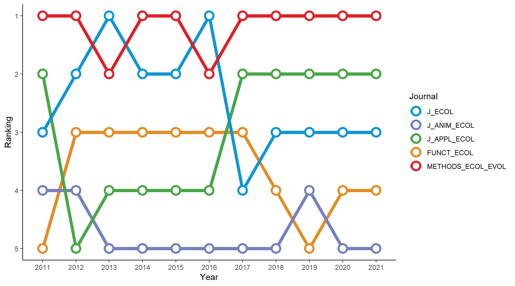
Seems that Methods in Ecology and Evolution has been the leading journal of the five in recent years!
This figure looks fine, but we can make it shine. Let’s spice it up!
There are a few things we can do to modify the chart:
(1) Add a title, a subtitle, and a caption (2) Remove the legend and annotate the items directly in the plot panel (3) Change the background color
# install.packages("ggtext")  # install the package if you haven't
library(ggtext)  # for the function "element_markdown()"

# A color palette for the journals
col_pal <- set_names(c("#0e96d4", "#7581bd", "#48a749", "#e38d26", "#de2127"), nm = BES_journals)

# The journal labels on the left
Journal_label <- c("<span style = 'color: #de2127'>Methods in<br>Ecology and Evolution</span>",
                   "<span style = 'color: #48a749'>Journal of<br>Applied Ecology",
                   "<span style = 'color: #0e96d4'>Journal of Ecology</span>",
                   "<span style = 'color: #7581bd'>Journal of<br>Animal Ecology</span>",
                   "<span style = 'color: #e38d26'>Functional Ecology</span>")

# The fancy bump chart
ggplot(BES_journals_data) +
  geom_line(aes(x = Year, y = Ranking, color = Journal, group = Journal), size = 2) +
  geom_point(aes(x = Year, y = Ranking, color = Journal), shape = 21, fill = "white", size = 4, stroke = 2) +
  geom_text(data = data.frame(x = 11.5, y = 1:5), aes(x = x, y = y, label = y)) +
  scale_y_reverse(labels = Journal_label) +  # add the journal labels
  scale_color_manual(values = col_pal) +
  labs(title = "<img src='https://raw.githubusercontent.com/GenChangHSU/ggGallery/master/_posts/2022-08-01-post-18-bump-charts-with-ggplot/BES_logo_tp.png' width = '100'/>",  # add the BES logo
       subtitle = "Journal rankings based on their impact factors each year",
       caption = "Data source: Journal Citation Reports") +
  theme_void() +
  theme(legend.position = "none",
        plot.margin = margin(5, 5, 5, 5),
        plot.background = element_rect(fill = "#b6e3d4", color = NA),
        plot.title = element_markdown(margin = margin(b = 0, unit = "mm"), hjust = -0.1),
        plot.subtitle = element_text(margin = margin(t = -10, b = 10, unit = "mm"), hjust = 0.35, face = "bold", size = 13),
        plot.caption = element_text(margin = margin(t = 5, unit = "mm"), face = "italic", color = "grey60"),
        axis.text.x = element_text(margin = margin(t = 3, unit = "mm"), size = 10),
        axis.text.y = element_markdown(margin = margin(r = -5, unit = "mm"), color = NULL, size = 11))
Here I used the function element_markdown() from the
package ggtext
to embed a logo in the plot title via the HTML <img>
tag and to label the journals via the HTML <span>
tag. The package has many nice features for text manipulations in
ggplots using HTML and CSS syntax. I won’t go into the details here, but
do check out my previous post
on this topic if interested!
A modified bump chart with smooth curves
Instead of connecting the dots with straight line segments like what
we did in the above figure, we can use smooth curves. This is actually
super easy: just replace geom_line() with
geom_bump()!
# install.packages("ggbump")  # install the package if you haven't
library(ggbump)
library(ggtext)

col_pal <- set_names(c("#0e96d4", "#7581bd", "#48a749", "#e38d26", "#de2127"), nm = BES_journals)

Journal_label <- c("<span style = 'color: #de2127'>Methods in<br>Ecology and Evolution</span>",
                   "<span style = 'color: #48a749'>Journal of<br>Applied Ecology",
                   "<span style = 'color: #0e96d4'>Journal of Ecology</span>",
                   "<span style = 'color: #7581bd'>Journal of<br>Animal Ecology</span>",
                   "<span style = 'color: #e38d26'>Functional Ecology</span>")

# The modified bump chart using "geom_bump()"
ggplot(BES_journals_data) +
  geom_bump(aes(x = Year, y = Ranking, color = Journal, group = Journal), size = 2) +
  geom_point(aes(x = Year, y = Ranking, color = Journal), shape = 21, fill = "white", size = 4, stroke = 2) +
  geom_text(data = data.frame(x = 11.5, y = 1:5), aes(x = x, y = y, label = y)) +
  scale_y_reverse(labels = Journal_label) +
  scale_color_manual(values = col_pal) +
  labs(title = "<img src='https://raw.githubusercontent.com/GenChangHSU/ggGallery/master/_posts/2022-08-01-post-18-bump-charts-with-ggplot/BES_logo_tp.png' width = '100'/>",
       subtitle = "Journal rankings based on their impact factors each year",
       caption = "Data source: Journal Citation Reports") +
  theme_void() +
  theme(legend.position = "none",
        plot.margin = margin(5, 5, 5, 5),
        plot.background = element_rect(fill = "#b6e3d4", color = NA),
        plot.title = element_markdown(margin = margin(b = 0, unit = "mm"), hjust = -0.1),
        plot.subtitle = element_text(margin = margin(t = -10, b = 10, unit = "mm"), hjust = 0.35, face = "bold", size = 13),
        plot.caption = element_text(margin = margin(t = 5, unit = "mm"), face = "italic", color = "grey60"),
        axis.text.x = element_text(margin = margin(t = 3, unit = "mm"), size = 10),
        axis.text.y = element_markdown(margin = margin(r = -5, unit = "mm"), color = NULL, size = 11))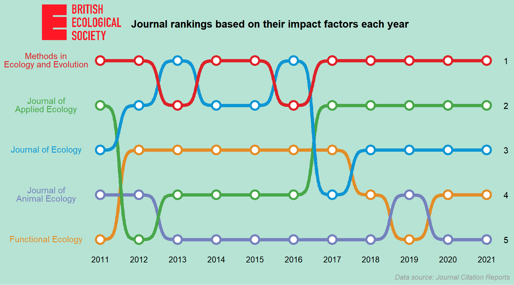
Looks pretty cool (a bit like subway maps)!
Advanced topic - Ribbon bump chart
For the purpose of science communication, the bump charts we’ve created above are pretty much enough. But as a ggplot geek, it’s always fun to challenge myself a bit and go a step further to try out something cool. This is the motive for this advanced topic! Also, a shout-out to the author of the Tweet I mentioned at the beginning of the post. The idea was largely inspired by the chart he made and much of the code below is modified from his GitHub repository.
Creating a ribbon bump chart is not an easy task and requires some data manipulations. I’ll break down the process into four steps and explain what I’m doing in each step. I think this would make it easier to understand the underlying principles and hopefully you’ll be able to build your own chart in the future.
So the four steps are: (1) Create a stacked barplot of journals’ impact factors over year (2) Compute the curves that connect the upper/lower ends of the bars for each journal (3) Add ribbons to the stacked barplot (4) Polish the appearance of the chart
Let’s kick off our plotting journey. Enjoy!
Step 1. Create a stacked barplot of journals’ impact factors over year
To create a stacked barplot of the journals’ IFs, we need to determine the upper and lower ends of the bars. We’ll do this by first arranging the journals in a descending order based on their rankings each year (so the lowest-ranking journal will be on the top of the dataframe) and then calculating the cumulative sums of the journals’ IFs, which will be the upper ends of the bars. For the lower ends, they’ll be the cumulative sums minus the journals’ own IFs.
It’s noteworthy that here we won’t use the conventional geom layer
geom_bar() to create the barplot, but
geom_rect() instead. The main reason for using
geom_rect() rather than geom_bar() is that
geom_rect() allows us to order the bars differently for
each year, whereas geom_bar() will place the bars in the
same order across years. Since the journal rankings varied across years,
we should use the former.
# Calculate the cumulative sums of the journals' IFs
BES_journals_data_bars <- BES_journals_data %>%
  arrange(Year, desc(Ranking)) %>%
  group_by(Year) %>%
  mutate(y_upper = cumsum(IF),
         y_lower = cumsum(IF) - IF) %>%
  ungroup()

# A color palette for the journals
col_pal <- set_names(c("#0e96d4", "#7581bd", "#48a749", "#e38d26", "#de2127"), nm = BES_journals)

# Create a stacked barplot of the journals' IFs each year
ribbon_bumpchart_bars <- ggplot(BES_journals_data_bars) +
  geom_rect(aes(xmin = as.numeric(Year) - 0.05, xmax = as.numeric(Year) + 0.05,
                ymin = y_lower, ymax = y_upper, fill = Journal), color = "white") +
  scale_fill_manual(values = col_pal) +
  theme_classic()

ribbon_bumpchart_bars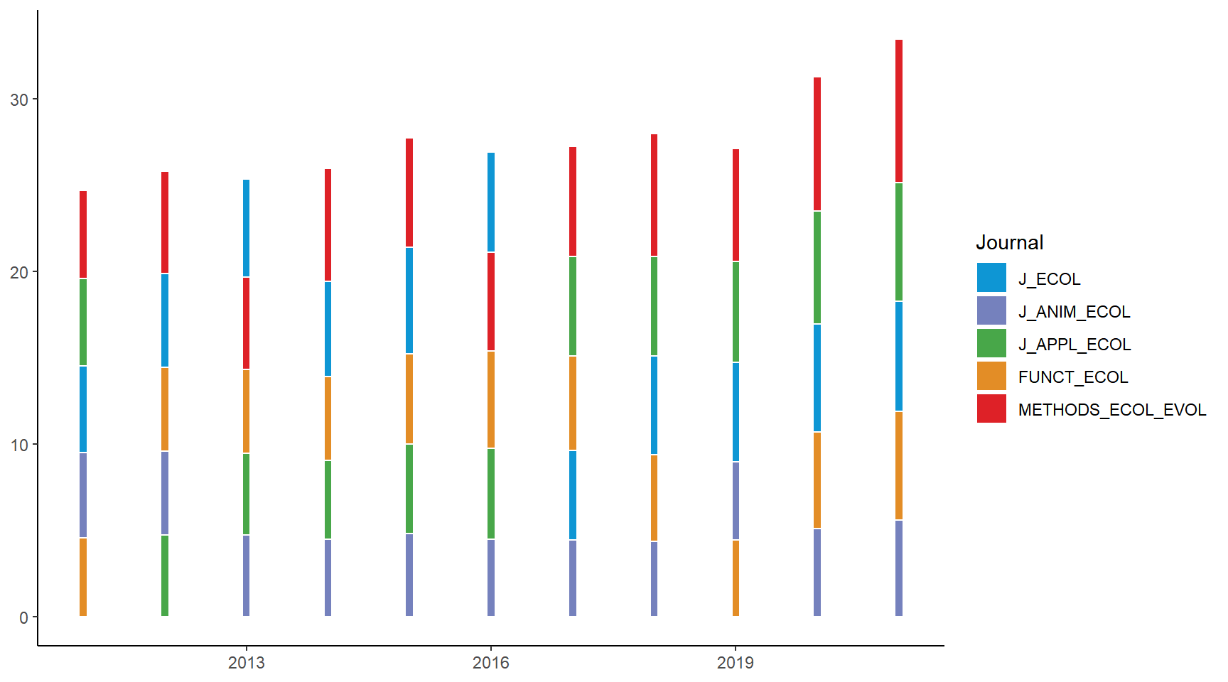
Step 2. Compute the curves that connect the upper/lower ends of the bars for each journal
Now comes the core part of the process: computing the curves that connect the upper/lower ends of the bars for each journal. These upper/lower curves form the boundaries of the ribbons that we’ll be adding to the plot later. We’ll split the original dataframe into individual subsets by journal and do the computation separately for each of them.
First, for each subset, we’ll create four new columns: x_from, x_to, y_from, and y_to. x_from is the current year plus the bar width (which is 0.05); x_to is the next year minus bar width; y_from is the upper/lower ends of the bars in the current year; y_to is the upper/lower ends of the bars next year. Together, these four columns serve as the x- and y-coordinates of the two points (x_from, y_from) and (x_to, y_to), between which a smooth connecting curve will be derived.
Note that in the below code chunk, the y_to for the
year 2022 was set to NA because there is no next bar to go,
and the row for that year was later removed. Also, I subtracted 0.1 from
the upper end and added 0.1 to the lower end to create a margin between
ribbons so that the ribbons will not go shoulder to shoulder when we
plot them later.
Next, we’ll use the function sigmoid() from the package
ggbump to compute a smooth sigmoid curve between the two
points (x_from, y_from) and
(x_to, y_to). The smoothness of the
curve can be adjusted via the arguments n and
smooth (play around with different values to see how the
ribbons change!).
Finally, we’ll merge the results (the x- and y-coordinates of the points forming the smooth curves) of each subset into a single dataframe, which contains all the information we need for plotting the ribbons.
library(ggbump)  # for the function "sigmoid()"

# Compute the upper/lower curves connecting the bars
BES_journals_data_ribbons <- BES_journals_data_bars %>%
  split(., .$Journal) %>%
  map(., function(data){

    # the upper curve
    upper_curve <- data %>%
      select(Journal, Year, y_upper) %>%
      mutate(x_from = as.numeric(Year) + 0.05,
             x_to = as.numeric(Year) + 1 - 0.05,
             y_from = y_upper - 0.1,  # 0.1 sets the margin between adjacent ribbons
             y_to = c(y_upper[-1], NA) - 0.1) %>%
      filter(Year != "2021") %>%
      rowwise() %>%
      mutate(curve = list(sigmoid(x_from, x_to, y_from, y_to, n = 100, smooth = 8))) %>%
      unnest() %>%
      select(Journal, x, y_upper = y)

    # the lower curve
    lower_curve <- data %>%
      select(Journal, Year, y_lower) %>%
      mutate(x_from = as.numeric(Year) + 0.05,
             x_to = as.numeric(Year) + 1 - 0.05,
             y_from = y_lower + 0.1,
             y_to = c(y_lower[-1], NA) + 0.1) %>%
      filter(Year != "2021") %>%
      rowwise() %>%
      mutate(curve = list(sigmoid(x_from, x_to, y_from, y_to, n = 100, smooth = 8))) %>%
      unnest() %>%
      select(Journal, x, y_lower = y)

    # put the two dataframes together
    curve <- left_join(upper_curve, lower_curve[, -1], by = "x")
  }) %>% bind_rows()  # merge the results

datatable(BES_journals_data_ribbons, options = list(pageLength = 5))
Step 3. Add ribbons to the stacked barplot
Ready to draw the ribbons! We’ll use geom_ribbon() and
specify the upper (ymax =) and lower (y_min =)
boundary. The ribbons were adjusted to be slightly transparent so that
when two ribbons cross each other, the one beneath can still be
seen.
We’ll also use the function move_layers() from the
package gginnards to pull the bars (which were drawn on the
geom_rect() layer) to the top. Otherwise, the bars will be
completely covered by the ribbons!
# Add the ribbons to the barplot
ribbon_bumpchart <- ribbon_bumpchart_bars +
  geom_ribbon(data = BES_journals_data_ribbons,
              aes(x = x, ymax = y_upper, ymin = y_lower, fill = Journal), alpha = 0.75)

# Move the bars to the top
library(gginnards)

ribbon_bumpchart <- move_layers(ribbon_bumpchart, "GeomRect", position = "top")
ribbon_bumpchart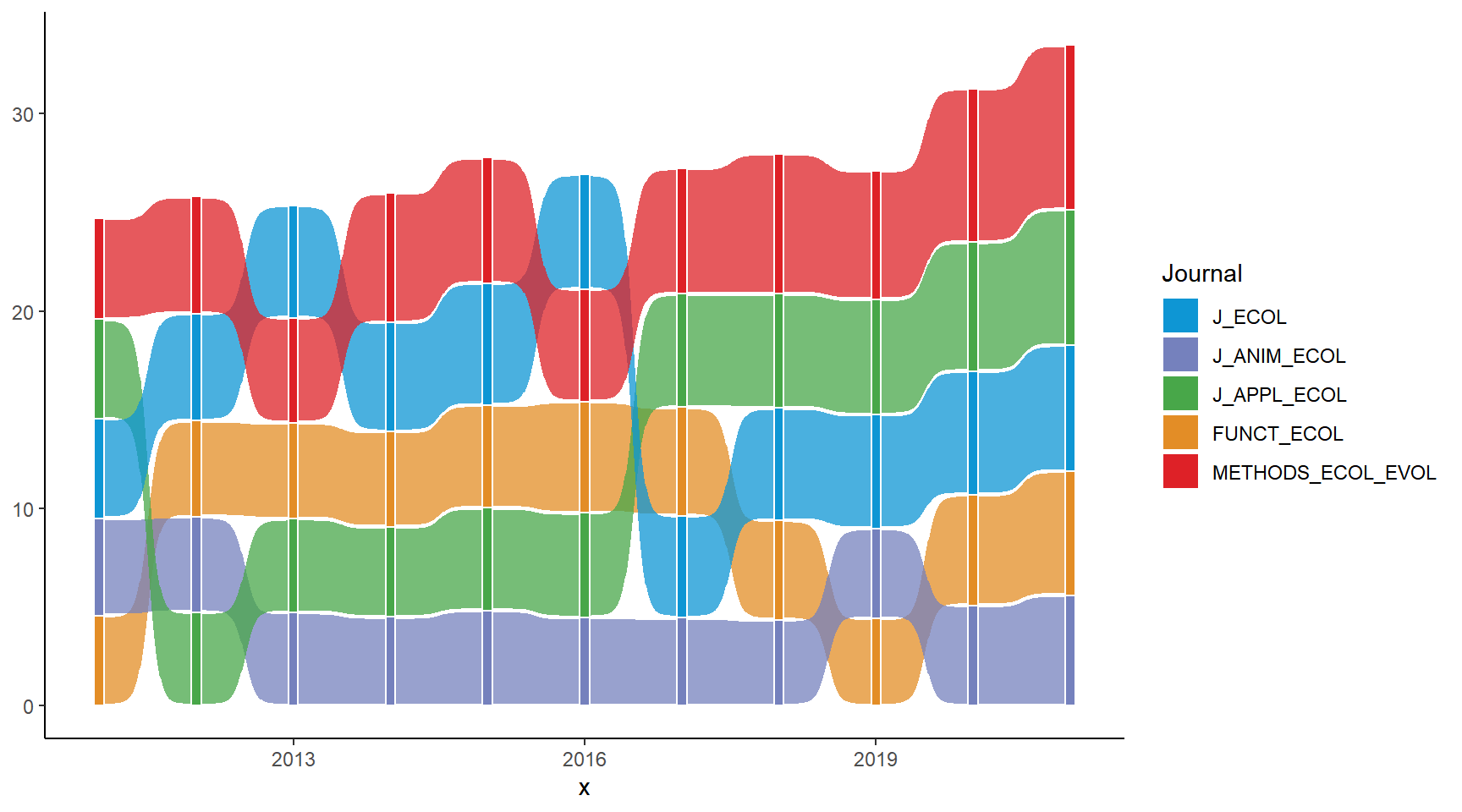
Step 4. Polish the appearance of the chart
Here we are at our final step: polishing the appearance of the chart! Again, we’ll add a logo title, a subtitle, and a caption to it. We’ll also label the years along the x-axis as well as the journal names on the left of the ribbons.
# Journal labels
Journal_label <- c("<span style = 'color: #de2127'>Methods in<br>Ecology and Evolution</span>",
                   "<span style = 'color: #48a749'>Journal of<br>Applied Ecology",
                   "<span style = 'color: #0e96d4'>Journal of Ecology</span>",
                   "<span style = 'color: #7581bd'>Journal of<br>Animal Ecology</span>",
                   "<span style = 'color: #e38d26'>Functional Ecology</span>")

# Journal label positions
Journal_label_position <- filter(BES_journals_data_bars, Year == 2011)$y_upper - filter(BES_journals_data_bars, Year == 2011)$IF/2

# Modify the appearance of the chart
ribbon_bumpchart <- ribbon_bumpchart +
  scale_x_continuous(breaks = c(2011:2021)) +
  scale_y_continuous(breaks = Journal_label_position, labels = rev(Journal_label)) +
  labs(title = "<img src='https://raw.githubusercontent.com/GenChangHSU/ggGallery/master/_posts/2022-08-01-post-18-bump-charts-with-ggplot/BES_logo_tp.png' width = '100'/>",
       subtitle = "Journal rankings based on their impact factors each year",
       caption = "Data source: Journal Citation Reports") +
  theme_void() +
  theme(legend.position = "none",
        plot.margin = margin(5, 5, 5, 5),
        plot.background = element_rect(fill = "#b6e3d4", color = NA),
        plot.title = element_markdown(margin = margin(b = -5, unit = "mm"), hjust = -0.1),
        plot.subtitle = element_text(margin = margin(t = -5, b = -10, unit = "mm"), hjust = 0.35, face = "bold", size = 13),
        plot.caption = element_text(margin = margin(t = 5, unit = "mm"), face = "italic", color = "grey60"),
        axis.text.x = element_text(margin = margin(t = 1, unit = "mm"), size = 10),
        axis.text.y = element_markdown(margin = margin(r = -5, unit = "mm"), color = NULL, size = 11))

ribbon_bumpchart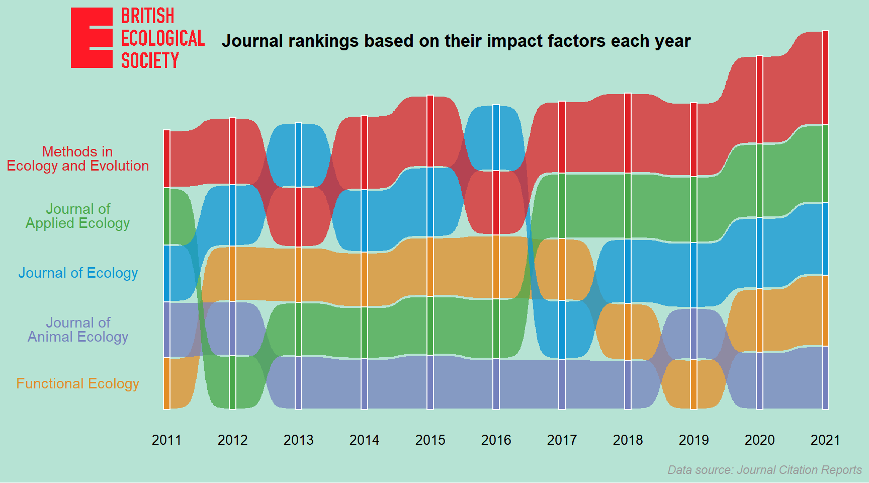
After a long trek through the code, we’ve now reached the destination of our plotting journey. Hooray!
Summary
To recap what we did in this post, we first created a basic bump
charts from scratch using geom_line() and
geom_point(). Next, we used geom_bump() to
create a modified bump chart with smooth curves connecting the points.
Lastly, we went on an adventure and created a ribbon bump chart step by
step, including some data manipulations to get the data we need for
plotting. After doing this post, I found bump charts quite handy and I
think I should use them more often for communication. I believe you
think so too!
Hope you learn something useful from this post and don’t forget to leave your comments and suggestions below if you have any!