Background
Welcome to the fifth post of ggplot Legend Tips
Series! This post is a continuation of a previous
post, where I introduced how to modify the appearance of discrete
legends in ggplots with guides(), such as legend label
font, legend key size, and legend direction and position (give it a read
if you’re interested!).
Today, we will explore another way to modify discrete legends: using
scale_XX family of functions (e.g.,
scale_color_manual() and
scale_shape_manual()). There are three handy adjustments
you can do with these scale functions:
(1) Change legend name and labels (2) Change the order of legend keys (3) Selectively display certain legend keys
Without further ado, let’s jump right in!
An example with scale_color_brewer()
We will use the ChickWeight
dataset for our example plots. The dataset contains the body weights of
chicks fed with four different protein diets recorded over a course of
20 days.
Let’s compute the average weight of chicks in each diet treatment and
plot the growth curve over time. We’ll map diet treatment to the “color”
aesthetic and use scale_color_brewer() to set the colors
for the legend.
library(tidyverse)

### Average chick weight over time in each diet treatment
ChickWeight_avg <- ChickWeight %>%
  group_by(Diet, Time) %>%
  summarise(weight = mean(weight))

### Growth curve of the chicks
P <- ggplot(ChickWeight_avg) +
  geom_line(aes(x = Time, y = weight, color = Diet)) +
  geom_point(aes(x = Time, y = weight, color = Diet)) +
  labs(x = "Day", y = "Weight (g)") +
  theme_classic(base_size = 14) +
  scale_color_brewer(palette = "Set1")

P

(1) Change legend name and labels
Changing legend name and labels is perhaps the most common thing
ggplot users would do for their legends. This is super straightforward:
simply specify the argument name = for the new legend name
and pass a vector of labels to argument labels = in
scale_color_brewer(). Easy-peasy!!!
P + scale_color_brewer(palette = "Set1",
                       name = "Diet Treatment",  # new legend name
                       labels = c("Red diet", "Blue diet", "Green diet", "Purple diet"))  # new legend labels

(2) Change the order of legend keys
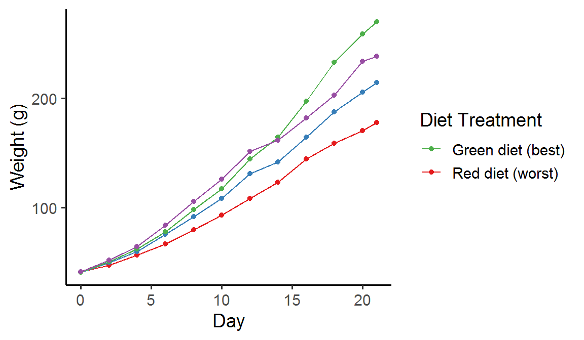
The second thing we can do is reordering the legend keys. As you can see, the chicks fed with “Green” diet grew the best, followed by those fed with “Purple” and “Blue” diet, and those fed with “Red” diet grew the worst. So can we change the order of legend keys to reflect this ranking?
Of course we can! The main argument for this is break =,
which takes a vector of levels in the legend variable (in this example
1, 2, 3, and 4 in the factor Diet). The order of the levels
passed to the argument will determine the order of key items displayed
in the legend.
P + scale_color_brewer(palette = "Set1",
                       name = "Diet Treatment",
                       breaks = c(3, 4, 2, 1),  # new order of the legend keys
                       labels = c("Green diet", "Purple diet", "Blue diet", "Red diet"))

(3) Selectively display certain legend keys
Suppose we want to show only the best (“Green”) and the worst diet
(“Red”) in the legend and hide the other two intermediate ones. We can
do this by passing the selected levels (here 1 and 3) to the
break = argument in the desired order (3 first then 1):
P + scale_color_brewer(palette = "Set1",
                       name = "Diet Treatment",
                       breaks = c(3, 1),  # select the best and the worst diet
                       labels = c("Green diet (best)", "Red diet (worst)"))
It is worth noting that there is a second way to selectively display
certain legend keys, via the argument limits =. However,
the argument will affect the main plot as well; the levels not specified
in limits = will not be drawn in the plot! In fact, this is
basically the same as dropping the levels in the factor, and so the
aesthetic mapping will change accordingly. See an example below:
P + scale_color_brewer(palette = "Set1",
                       name = "Diet Treatment",
                       limits = c(3, 1),  # select the best and the worst diet
                       labels = c("Best diet", "Worst diet"))  # the best and the worst diet are not in green and red now!
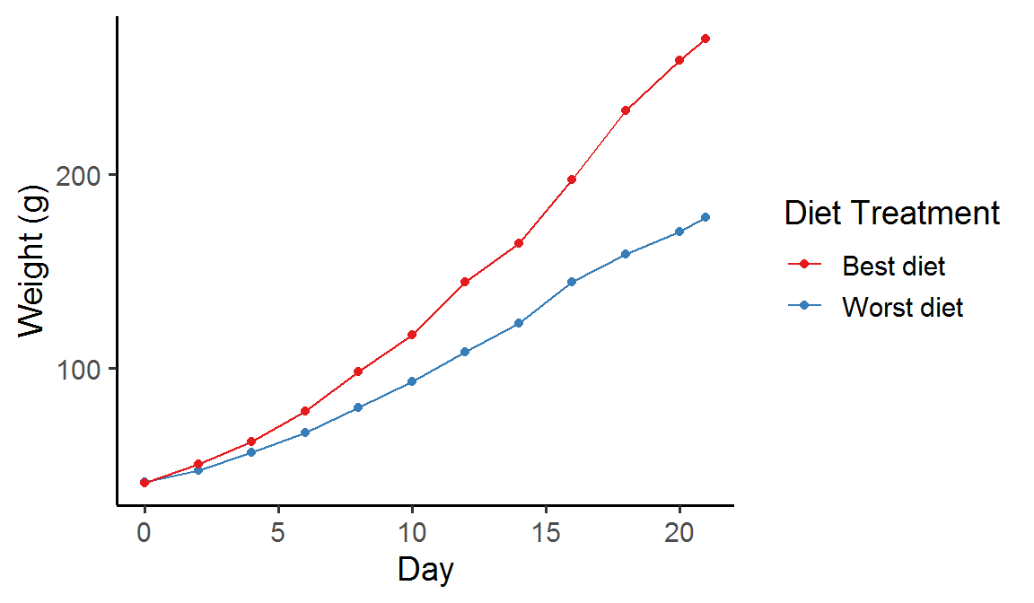
As you can see, only the curves for the best and the worst diet are shown in the plot, and the colors of these two curves have also changed because the number of levels is no longer 4 but 2.
So depending on the purpose of your figure, you might want to use
breaks = or limits = to select certain legend
keys of interest. But just keep in mind that the aesthetic mapping may
differ between the two methods!
Summary
In this post, we looked at how to modify a discrete legend via the
arguments in scale_color_brewer(): names = and
labels = for legend name and labels, as well as
breaks = and limits = for legend keys. The
same principle applies to other discrete legend types too, for instance,
linetype and shape.
Hope you learn something useful and don’t forget to leave your comments and suggestions below if you have any!