Introduction
Animations are a powerful tool for data visualization and communication: They turn static images/plots into dynamic stories. If we say A figure is worth a thousand words, then I would argue that An animation is worth a thousand figures.
Creating ggplot animations is not a daunting task: The extension package gganimate provides a plethora of functions to make animations with ggplots and customize them. (See this guest post by William Ou on conveying the essence of data using gganimate!) But if you understand the underlying principle of animations, they are essentially an array of individual images/plots displayed in a chronological order, and we can easily make animations (for any kind of R plots) ourselves.
In this post, I’m going to show you how to make ggplot animations by hand based on this simple principle, without turning to gganimate functions. I think this will make a fun coding exercise and at the same time sharpen our programming skills. Also, a big shout-out to June Choe for his neat post, which is the ultimate inspiration for this one. Enjoy!
Create a ggplot animation by hand
(1) The static plot
We’ll begin by creating a toy plot: A plot consists of ten geom_rect() layers with successively narrower widths, and each rectangle is filled with a different color:
library(tidyverse)

### The toy dataframe
df <- data.frame(xmin = 0, xmax = 0, ymin = -10, ymax = 10)

### The color vector
color_vec <- terrain.colors(n = 10)

### The toy plot
ggplot(df) +
  geom_rect(aes(xmin = xmin - 10^1.0, xmax = xmax + 10^1.0, ymin = ymin, ymax = ymax), fill = color_vec[10]) +
    geom_rect(aes(xmin = xmin - 9^0.9, xmax = xmax + 9^0.9, ymin = ymin, ymax = ymax), fill = color_vec[9]) +
    geom_rect(aes(xmin = xmin - 8^0.8, xmax = xmax + 8^0.8, ymin = ymin, ymax = ymax), fill = color_vec[8]) +
    geom_rect(aes(xmin = xmin - 7^0.7, xmax = xmax + 7^0.7, ymin = ymin, ymax = ymax), fill = color_vec[7]) +
    geom_rect(aes(xmin = xmin - 6^0.6, xmax = xmax + 6^0.6, ymin = ymin, ymax = ymax), fill = color_vec[6]) +
    geom_rect(aes(xmin = xmin - 5^0.5, xmax = xmax + 5^0.5, ymin = ymin, ymax = ymax), fill = color_vec[5]) +
    geom_rect(aes(xmin = xmin - 4^0.4, xmax = xmax + 4^0.4, ymin = ymin, ymax = ymax), fill = color_vec[4]) +
    geom_rect(aes(xmin = xmin - 3^0.3, xmax = xmax + 3^0.3, ymin = ymin, ymax = ymax), fill = color_vec[3]) +
    geom_rect(aes(xmin = xmin - 2^0.2, xmax = xmax + 2^0.2, ymin = ymin, ymax = ymax), fill = color_vec[2]) +
    geom_rect(aes(xmin = xmin - 1^0.1, xmax = xmax + 1^0.1, ymin = ymin, ymax = ymax), fill = color_vec[1]) +
    scale_x_continuous(limits = c(-10, 10)) +
  theme_void()
The code looks quite like an eyesore, doesn’t it? The arguments in all geom_rect() layers are basically the same; the only difference is the supplied values. Let’s fix it.
(2) Reduce the repetitive code
The function reduce(), as its name suggests, is meant to “reduce” the repetitive code by iteratively applying a function over a list/vector of values and taking the output in the current iteration as the input for the next iteration. Sounds abstract? Let’s take a look at how it actually works:
### Reduce the repetitive code using "reduce()"
reduce(10:1,  # a vector of values to iterate over
       .f = ~ .x + geom_rect(aes(xmin = xmin - .y^(.y/10), xmax = xmax + .y^(.y/10), ymin = ymin, ymax = ymax), fill = color_vec[.y]),  # the function
       .init = ggplot(df) + theme_void()  # the constant part of the code
       )
In the above code, we supplied a vector of values for the arguments in the function, the function itself, and the constant part of the code to start the iteration.
The first iteration would be:
ggplot(df) +
  theme_void() +
  geom_rect(aes(xmin = xmin - 10^(10/10), xmax = xmax + 10^(10/10), ymin = ymin, ymax = ymax), fill = color_vec[10])
The second iteration would be:
ggplot(df) +
  theme_void() +
  geom_rect(aes(xmin = xmin - 10^(10/10), xmax = xmax + 10^(10/10), ymin = ymin, ymax = ymax), fill = color_vec[10]) +
  geom_rect(aes(xmin = xmin - 9^(9/10), xmax = xmax + 9^(9/10), ymin = ymin, ymax = ymax), fill = color_vec[9])
So on and so forth. After the last iteration was completed, the final product would be returned (which is the same as what you saw in the first code chunk).
(3) The intermediate plots
Remember that to create an animation, we need a sequence of images/plots. We only have one plot now. So where are our plots? Don’t worry; we’re going to get them here using the cool function accumulate(): This function works essentially in the same way as reduce(), except that it keeps all the intermediate outputs from the iterations. Simply swap out reduce() for accumulate() to get all the intermediate plots stored in a list:
### Use "accumulate()" to get the intermediate plots
p_intermediate <- accumulate(10:1,
                             .f = ~ .x + geom_rect(aes(xmin = xmin - .y^(.y/10), xmax = xmax + .y^(.y/10), ymin = ymin, ymax = ymax), fill = color_vec[.y]),
                             .init = ggplot(df) + theme_void()
                             )

library(patchwork)
wrap_plots(p_intermediate[-1], ncol = 4, nrow = 3, byrow = T)  # omit the first empty plot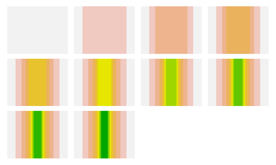
(4) Make them alive
Having a sequence of plots at hand, it’s time to make them alive!
Here, we’ll use the package magick to create the animation. The package has lots of handy functions for image processing. First, we need to convert the ggplots into “magick-image” objects that the package works with. We’ll then use image_join() to combine the individual magick-images into a single magick-image with multiple frames. Finally, we’ll pass it to image_animate() to make the animation.
# install.packages("magick")  # install the package if you haven't
library(magick)

### Convert the ggplots into "magick-image" objects
images <- map(1:length(p_intermediate), function(x) {
  image <- image_graph(width = 400, height = 300, res = 600)
  plot(p_intermediate[[x]])
  dev.off()
  image
})

### Combine the individual images
image_frames <- image_join(images)

### Animate the frames
image_animation <- image_animate(image_frames, fps = 5)  # modify "fps" to adjust the animation speed
print(image_animation)
# A tibble: 11 × 7
format width height colorspace matte filesize density
<chr> <int> <int> <chr> <lgl> <int> <chr>
1 gif 400 300 sRGB TRUE 0 600x600
2 gif 400 300 sRGB TRUE 0 600x600
3 gif 400 300 sRGB TRUE 0 600x600
4 gif 400 300 sRGB TRUE 0 600x600
5 gif 400 300 sRGB TRUE 0 600x600
6 gif 400 300 sRGB TRUE 0 600x600
7 gif 400 300 sRGB TRUE 0 600x600
8 gif 400 300 sRGB TRUE 0 600x600
9 gif 400 300 sRGB TRUE 0 600x600
10 gif 400 300 sRGB TRUE 0 600x600
11 gif 400 300 sRGB TRUE 0 600x600
Here you go!
Summary
To recap what we did, we first used the function accumulate() to generate a sequence of ggplots, and then we used the functions from the package magick to turn the individual plots into an animation. In fact, you can make animations for any images/plots you have. The key is to get an array of images/plots and combine them in a desired order!
Hope you learn something useful from this post and don’t forget to leave your comments and suggestions below if you have any!