Background
Welcome to my second blog post series: the ggplot Map Series! Maps are a staple for research, science communication, and even everyday life. In this series, I’ll write about making all kinds of maps in ggplots: polygon maps, vector maps, and raster maps, using a variety of data sources from built-in package data sets and online databases, to manually-created data and other external files. Making maps is a critical skill to have under the belt and will certainly go a long way, and I hope this series will come in handy for every reader, you included of course!
Introduction
There are a diverse set of maps in ggplots. In this first post of the series, I’ll just start simple with the most basic type of maps—the polygon maps, using the built-in map data from the maps package.
Create a polygon map with maps
In the following section, we’ll first create a world base map using the world map data in maps package. Next, we’ll turn this base map into a choropleth map by adding a theme to it. Finally, we’ll take a look at some other available map data in the maps package.
1. A basic world map
Let’s make a world base map by retrieving the world data from the maps package. The returned object is a dataframe with a set of longitude and latitude coordinates that define the border of each country. To draw the map, we’ll pass this dataframe into geom_polygon() and map the longitude and latitude coordinates to x and y aesthetic. Also, we need to specify the “group” aesthetic so that ggplot knows how the points are grouped in order to form the polygons.
library(tidyverse)
library(maps)

### Get the world map data
world_map <- map_data(map = "world")
head(world_map)
long lat group order region subregion
1 -69.89912 12.45200 1 1 Aruba <NA>
2 -69.89571 12.42300 1 2 Aruba <NA>
3 -69.94219 12.43853 1 3 Aruba <NA>
4 -70.00415 12.50049 1 4 Aruba <NA>
5 -70.06612 12.54697 1 5 Aruba <NA>
6 -70.05088 12.59707 1 6 Aruba <NA>### Make a world base map
P_world_map <- ggplot(data = world_map) +
geom_polygon(aes(x = long, y = lat, group = group), color = "white", fill = "grey") + # need to specify the "group" aesthetic
geom_hline(yintercept = Inf, color = "grey") + # top panel border
geom_hline(yintercept = -Inf, color = "grey") + # bottom panel border
geom_vline(xintercept = Inf, color = "grey") + # right panel border
geom_vline(xintercept = -Inf, color = "grey") + # left panel border
theme_void() # empty theme
P_world_map
Do you notice that there is a “region” column in the world map data containing the country names? The map_data() function has a useful argument that allows user to subset the world data by this column. For example, we can get the data for Australia and draw it on the base map using different border and fill colors:
### Get the Australia data
world_map_Australia <- map_data(map = "world", region = "Australia")

### Draw the Australia map with different colors
P_world_map <- P_world_map +
  geom_polygon(data = world_map_Australia, aes(x = long, y = lat, group = group), color = "green4", fill = "green3")

P_world_map
Another thing we can do is to add points to the map. Let’s get a table of top peaks in the world from Wikipedia and draw them on the map.
library(rvest)  # the package for web scraping

### Get a table of world's top peaks from Wikipedia
top_peaks_df_raw <- read_html("https://en.wikipedia.org/wiki/List_of_highest_mountains_on_Earth") %>%
  html_element(xpath = '//*[@id="mw-content-text"]/div[1]/table[3]') %>%
  html_table()

### Data wrangling
top_peaks_df_clean <- top_peaks_df_raw %>%
  select(2, 3, 8) %>%
  `colnames<-`(c("Mountain", "Elevation", "Coordinates")) %>%
  slice(-(1:2)) %>%
  mutate(Mountain = ifelse(row_number(Mountain) == 1, "Mount Everest", Mountain)) %>%
  rowwise() %>%
  mutate(Coordinates = str_extract(Coordinates, pattern = "/ [0-9|.]*; [0-9|.]+")) %>%
  mutate(Coordinates = str_remove(Coordinates, pattern = "/ ")) %>%
  separate(col = "Coordinates", into = c("Lat", "Long"), sep = "; ", convert = T)

### Draw the peaks on the map
P_world_map <- P_world_map +
  geom_point(data = top_peaks_df_clean, aes(x = Long, y = Lat), shape = 17)

P_world_map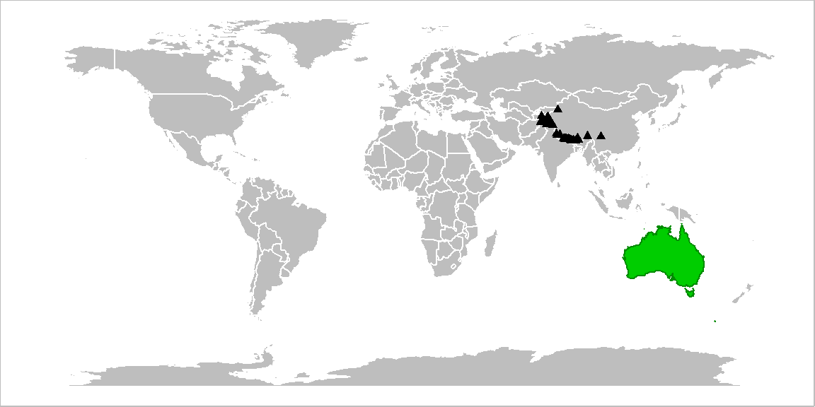
The default map projection is the Mercator projection, in which the true bearing and shape are preserved while the area is increasingly distorted towards the polar regions. We can apply other projections provided by the mapproj package. For example, the Mollweide projection sacrifices the bearing and shape for area, and so it is appropriate for maps that require a more accurate representation of country sizes. A full list of the available projections are shown on the help page of mapproject().
library(mapproj)

### Change the map projection to Mollweide projection
P_world_map +
coord_map(projection = "mollweide", xlim = c(-180, 180)) # need to set "xlim = c(-180, 180)" to avoid the weird plotting bug 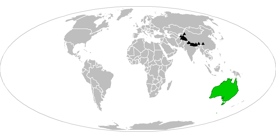
2. Choropleth map
A choropleth map is a thematic map that visualizes the quantity of a variable across a geographical area (e.g., the population size of each county in a country) using different colors. This kind of map provides an easy quick glance at the spatial patterns of the variable of interest.
Making a choropleth map is pretty similar to making a base map; the only additional step is to get the variable data and associate them with the map data. In the example below, we’re going to make a choropleth map of the bird species richness in the world. We first get a table of bird richness by country from the website, standardize the country names and merge the bird data into the world map data, and fill the countries by richness.
### Get a table of bird species richness by country
bird_by_country <- read_html("https://rainforests.mongabay.com/03birds.htm") %>%
  html_element("table") %>%
  html_table()

### Standardize the country names
library(countrycode)

bird_by_country <- bird_by_country %>%
  rename(region = `Country / region`,
         richness = `Bird species count`) %>%
  mutate(region_std = countryname(region)) %>%
  rowwise() %>%
  mutate(richness = str_remove(richness, pattern = ",") %>% as.numeric())

world_map <- world_map %>%
  mutate(region_std = countryname(region))

### Merge the bird data into the world map data
world_map <- world_map %>%
  left_join(bird_by_country, by = "region_std")

### Make the choropleth
P_choropleth <- ggplot(data = world_map) +
  geom_polygon(aes(x = long, y = lat, group = group, fill = richness), color = "grey") +
  geom_hline(yintercept = Inf, color = "grey") +
  geom_hline(yintercept = -Inf, color = "grey") +
  geom_vline(xintercept = Inf, color = "grey") +
  geom_vline(xintercept = -Inf, color = "grey") +
  scale_fill_viridis_c(name = "Number of species", breaks = seq(0, 1800, by = 300)) +
  guides(fill = guide_colorbar(title.position = "top")) +
  theme_void() +
  theme(legend.position = "top",
        legend.direction = "horizontal",
        legend.key.width = unit(0.8, "in"),
        legend.title = element_text(hjust = 0.5, vjust = 0.5, size = 11),
        legend.text = element_text(size = 10))

P_choropleth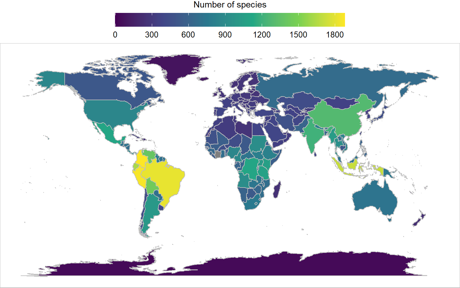
3. Other available map data
Besides the world map we’ve been playing around with earlier, there are a few other map data in the maps package: the first-level administrative divisions of the US, Italy, and France, as well as the second-level administrative divisions (counties) of the US. Let’s take a look at them:
### A function to create the map
map_fun <- function(map_name){

  map_dat <- map_data(map = map_name)

  P <- ggplot(data = map_dat) +
    geom_polygon(aes(x = long, y = lat, group = group), color = "white", fill = "grey") +
    geom_hline(yintercept = Inf, color = "grey") +
    geom_hline(yintercept = -Inf, color = "grey") +
    geom_vline(xintercept = Inf, color = "grey") +
    geom_vline(xintercept = -Inf, color = "grey") +
    labs(title = map_name) +
    theme_void() +
    theme(plot.title = element_text(hjust = 0.5, vjust = 3, size = 15))

  return(P)
}

### Make the maps
P_state <- map_fun("state")
P_italy <- map_fun("italy")
P_france <- map_fun("france")
P_us_county <- map_fun("county")

### Arrange the maps
library(patchwork)

(P_italy + plot_spacer() + P_state +
  plot_layout(ncol = 3, widths = c(1, 0.05, 1.5)))/
(P_france + plot_spacer() + P_us_county +
  plot_layout(ncol = 3, widths = c(1, 0.05, 1.5)))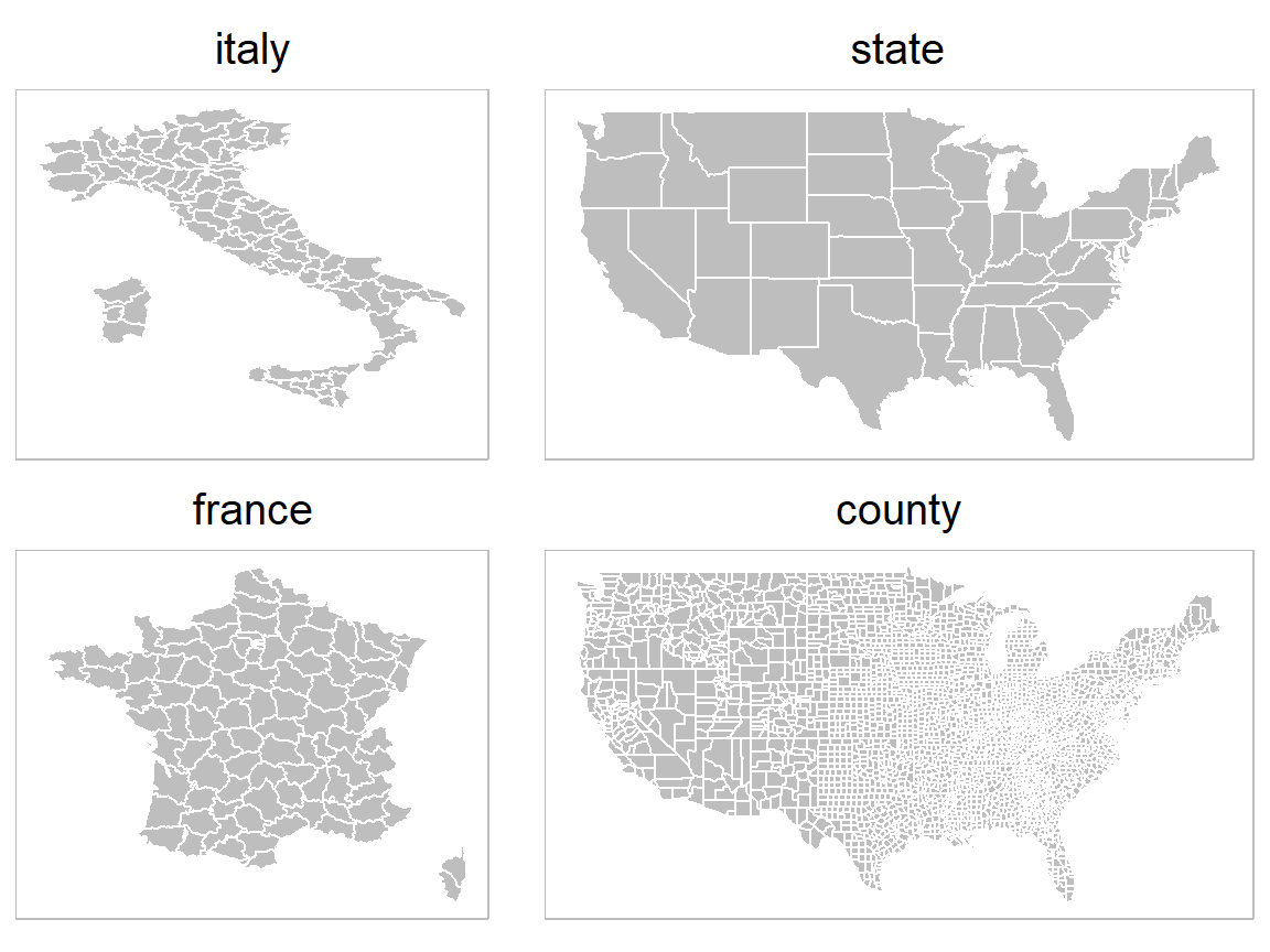
Summary
To recap, in this post we learned about how to create a polygon world map using the built-in data from the maps package, and how we can modify the base map by highlighting a certain area, adding points, and changing the map projection. We also went a step further to make a choropleth map of the bird species richness in the world. This type of map is more informative and it would be quite handy to know how to make it yourself!
Hope you learn something useful from this post and don’t forget to leave your comments and suggestions below if you have any!