Just realized the blog is one year old: it’s now entering the 1st instar! It has definitely grown a lot since it hatched. Keep developing!
Background
Faceting is arguably one of the most fantastic features of ggplots—it can quickly split the data into subsets by the given categorical variables and visualize these subsets in a grid of panels (facets). However, fine-tuning individual facets can be quite daunting. For example, I’ve been trying to reorder the items along the x-axis within each facet (i.e., different item orders for different facets), or to adjust the y-axis range and tick marks of some specific facets. These tasks don’t sound complicated on the surface, but there is actually no built-in ggplot function/argument to do so.
After doing some research online, I found two extension packages: tidytext and ggh4x, that have functions to deal with the these issues. I feel that many ggplot users might have encountered similar problems before, and this is indeed the motivator for me to write something on them. So in this post, I’ll share with you the two nice packages and hope they will come in handy for your own ggplots in the future!
1. Reorder items along x-axis for indiviudual facets
Let’s kick things off by creating a faceted plot using the diamonds dataset, which contains the attributes and prices of over 50,000 diamonds.
library(tidyverse)

ggplot(diamonds, aes(x = color, y = price)) +
  stat_summary(geom = "pointrange", fun.data = mean_cl_normal) +
  facet_wrap(~cut) +
  labs(x = "Color", y = "Price") +
  theme_bw(base_size = 13)
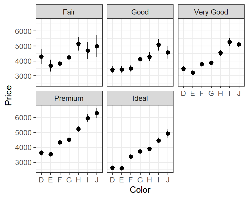
The above plot shows the means and 95% confidence intervals of the price of diamonds in different colors grouped by cut.
Now, we can reorder the points in an ascending fashion for individual facets, using the function reorder_within() and scale_x_reordered() from the package tidytext.
In reorder_within(x, by, within, fun), the argument x is the factor you would like to reorder, by is the continuous variable based on which x is reordered, within is the faceting variable, and fun is the function to compute a statistics on the by variable that determines the ordering of levels in x. Ok, that’s quite wordy. An example will make things clear:
# install.packages("tidytext")  # install the package if you haven't
library(tidytext)

ggplot(diamonds, aes(x = reorder_within(x = color, by = price, within = cut, fun = mean), y = price)) +
  stat_summary(geom = "pointrange", fun.data = mean_cl_normal) +
  facet_wrap(~cut, scales = "free_x") +  # need to set scales = "free_x" to allow for varying x-axes for individual facets
  scale_x_reordered() +  # specify "limits = rev" in the function to get descending points
  labs(x = "Color", y = "Price") +
  theme_bw(base_size = 13)

Reordered. Nice!
Say we want to adjust the item order for just the facet “Fair”. We can do so using the function facetted_pos_scales() from the package ggh4x:
# install.packages("ggh4x")  # install the package if you haven't
library(ggh4x)

# reordered color levels for "fair" diamonds
reordered_levels_fair <- fct_reorder(.f = filter(diamonds, cut == "Fair")$color,
                                     .x = filter(diamonds, cut == "Fair")$price,
                                     .fun = mean) %>% levels()

ggplot(diamonds, aes(x = color, y = price)) +
  stat_summary(geom = "pointrange", fun.data = mean_cl_normal) +
  facet_wrap(~cut, scales = "free_x") +
  labs(x = "Color", y = "Price") +
  theme_bw(base_size = 13) +
  facetted_pos_scales(x = list(cut == "Fair" ~ scale_x_discrete(limits = reordered_levels_fair)))

# x = list(...) means x-axis; cut == "Fair" identifies the facet "Fair"; ~ scale_x_discrete(limits = ) gives the new item order for that facet
2. Adjust y-axis scales for individual facets
There is an argument scales = in facet_wrap() that allows you to have varying axes for individual facets. You’ve already seen the use of scales = "free_x" in the previous plots, and the same goes for y-axis:
ggplot(diamonds, aes(x = color, y = price)) +
  stat_summary(geom = "pointrange", fun.data = mean_cl_normal) +
  facet_wrap(~cut, scales = "free_y") +
  labs(x = "Color", y = "Price") +
  theme_bw(base_size = 13)

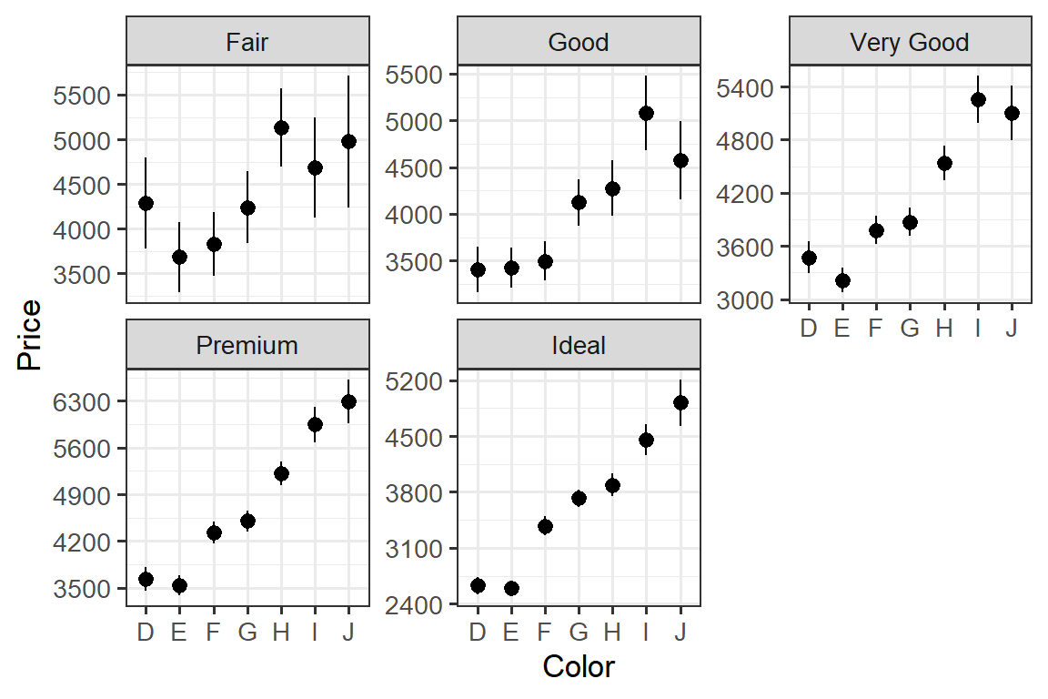
Now the y-axes are determined by the range of the data within each facet. However, what if you want to truly customize the axes, say changing the positions and labels of the tick marks? Again, facetted_pos_scales() can do the trick!
Let’s add a few tick marks to the “Fair” and “Premium” panel and cut a few for the “Very Good” and “Ideal” panel so that each panel has five tick marks:
library(ggh4x)

ggplot(diamonds, aes(x = color, y = price)) +
  stat_summary(geom = "pointrange", fun.data = mean_cl_normal) +
  facet_wrap(~cut, scales = "free_y") +  # need to set 'scales = "free_y"'
  labs(x = "Color", y = "Price") +
  theme_bw(base_size = 13) +
  # a list of panels to be modified
  facetted_pos_scales(y = list(cut == "Fair" ~ scale_y_continuous(breaks = c(3500, 4000, 4500, 5000, 5500)),
                               cut == "Premium" ~ scale_y_continuous(breaks = c(3500, 4200, 4900, 5600, 6300)),
                               cut == "Very Good" ~ scale_y_continuous(breaks = c(3000, 3600, 4200, 4800, 5400)),
                               cut == "Ideal" ~ scale_y_continuous(breaks = c(2400, 3100, 3800, 4500, 5200))))
Finally, we can combine both reordering and rescaling to create some cool visual effects:
library(tidytext)
library(ggh4x)

ggplot(diamonds, aes(x = reorder_within(x = color, by = price, within = cut, fun = mean), y = price)) +
  stat_summary(geom = "pointrange", fun.data = mean_cl_normal) +
  facet_wrap(~cut, scales = "free", nrow = 1) +
  scale_x_reordered() +
  labs(x = "Color", y = "Price") +
  theme_bw(base_size = 13) +
  facetted_pos_scales(y = list(cut == "Fair" ~ scale_y_continuous(limits = c(3800, 12000), breaks = c(3500)),
                               cut == "Good" ~ scale_y_continuous(limits = c(1500, 11500), breaks = c(3875)),
                               cut == "Very Good" ~ scale_y_continuous(limits = c(-1000, 10000), breaks = c(4250)),
                               cut == "Premium" ~ scale_y_continuous(limits = c(-5000, 9000), breaks = c(4625)),
                               cut == "Ideal" ~ scale_y_continuous(limits = c(-8500, 4700), breaks = c(5000))))
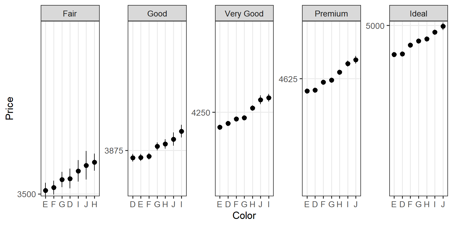
Of course this plot is definitely NOT appropriate for data communication; it’s so deceiving and misleading! Just for pure fun and also to demonstrate how versatile the two packages can be!!!
Summary
To summarize what we’ve talked about, we learned (1) how to reorder the items along the x-axis for individual facets (all at once) using reorder_within() and scale_x_reordered() from the tidytext package, or for specific facet(s) using facetted_pos_scales() from the ggh4x package, and (2) how to adjust axis scales for individual facets using facetted_pos_scales() from the ggh4x package. Having these two skills under your belt will certainly help you go a long way on your ggplot journey!
That’s it for now and hope the topic in this post would be helpful for you sometime in the future. And as always, don’t forget to leave your comments and suggestions below if you have any!