The problem
Sometimes in ggplots, we get two legends that represent the same variable yet are drawn separately, and we would like to combine the two legends into one. This is the problem we are going to look into in the post.
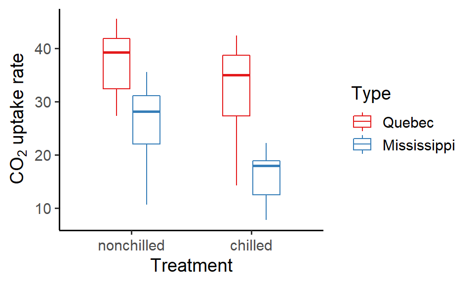
Here, we will be using the CO2 dataset for our example plots. Let’s first create a boxplot of the CO2 uptake rates of plant individuals under two chilling treatments. The boxes are colored by the site from which the plants originated (the column Type):
library(tidyverse)

P1 <- ggplot() +
  geom_boxplot(data = CO2, aes(x = Treatment, y = uptake, color = Type), width = 0.5, outlier.color = NA) +
  labs(x = "Treatment", y = expression(paste(CO[2], " uptake rate"))) +
  theme_classic(base_size = 14) +
  scale_color_brewer(palette = "Set1")

P1
Now suppose that we want to show the mean uptake rates too. We can compute the means for each Type and Treatment combination and add them to the boxes using another geom layer geom_point(). Also, since the column name Type doesn’t sound intuitive, we’ll change it to Site:
### Mean CO2 uptake rates by Type and Treatment
CO2_mean <- CO2 %>% group_by(Treatment, Type) %>%
  summarise(uptake_mean = mean(uptake)) %>%
  rename(Site = Type)

### Add the means (different point colors and shapes for the two sites)
P2 <- P1 + geom_point(data = CO2_mean, aes(x = Treatment, y = uptake_mean, color = Site, shape = Site), size = 2.5, position = position_dodge(width = 0.5))

P2
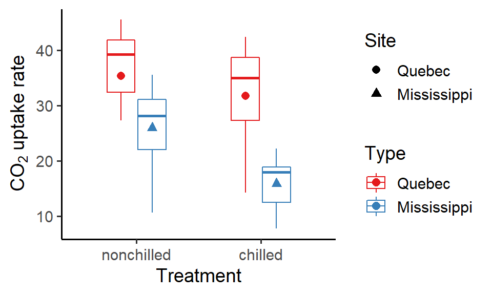
Hmm, the two legends (one mapped to “shape” and the other to “color” aesthetic) are not looking good. They shouldn’t have been separated! How can we put them together?
The solutions
It’s quite simple actually. There are two ways to fix the problem:
(1) Reset the legend title (2) Modify the legend keys
We’ll take a look at them now.
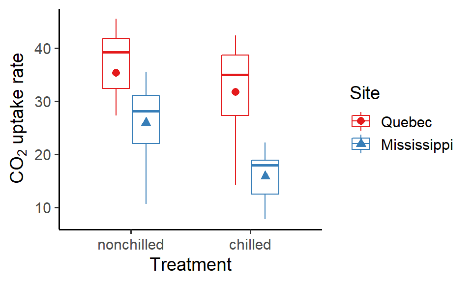
(1) Reset the legend title
The first way to combine the two legends is to set the same legend title for them, which can be done by specifying the argument name = in the scale_XX_YY() functions. By doing so, ggplot will know that the two legends are indeed the same one and merge them together.
P2 + scale_color_brewer(name = "Site", palette = "Set1") +
  scale_shape_manual(name = "Site", values = c(16, 17))

Tip 2. Modify the legend keys
The second way is more of a manual merging. The idea is that, we can modify the keys of one legend (in this example the boxes) by adding the keys of the other legend (in this example the points) and then hide the useless legend (in this example the legend for the points).
To do so, use guides(): simply pass a list of additional legend keys to the argument override.aes for the legend you want to modify and specify "none" to hide the useless legend:
P2 + guides(color = guide_legend(title = "Site", override.aes = list(shape = c(16, 17))),
            shape = "none")
Slightly more tedious than the first way, but still quite easy to do!
Summary
To recap the two ways to merge ggplot legends, we can (1) reset the legend title, or (2) modify the legend keys. Here I only showed you how to do it for two legends, but the principle applies to multiple legends as well. In fact, you can even “selectively” merge certain legends and leave others alone!
Hope you enjoy the reading and don’t forget to leave your comments and suggestions below if you have any!