Welcome to my new post! I have been a bit busy lately and I feel so excited to come back to my blog.
In this post, I will share with you some useful tips for adjusting the axis scales for individual panels when you’re using ggplot facets. I have been dealing with this problem several times before (and I guess you too!), and so I think this would be a great topic to write about. Keep reading and you will surely get something out of it!
The problem
Facets are quite useful for displaying data by category/level/class. However, sometimes you might have facets in different units, and this might cause some problems for the appearances of the panels (e.g., the panels with large absolute axis range may “distort” the ones with small absolute range). Although you can set scales = "free_XXX" to allow the axes to vary by panel, it might not be as satisfying as you think, and this would require further adjustments of the individual facet panels.
We will be using the airquality dataset as our example data. This dataset contains the daily measurements of four environmental variables, including ozone concentration, solar radiance, temperature, and wind speed, in New York from May to September 1973.
First, let’s visualize these four variables at once using facets:
library(tidyverse)

# Convert the original dataframe to long format
air_df <- airquality %>% pivot_longer(cols = 1:4,
                                      names_to = "Env_vars",
                                      values_to = "Values")

# Plot
P_air <- ggplot(air_df, aes(x = Day, y = Values, color = as.factor(Month), group = Month)) +
  geom_point() +
  geom_line() +
  labs(x = "Day of month", y = NULL) +
  scale_color_brewer(palette = "Set1",
                     labels = c("May", "June", "July", "August", "September")) +
  facet_wrap(~Env_vars,
             nrow = 2,
             scales = "free_y",
             strip.position = "left",
             labeller = as_labeller(c(Temp = "Temperature (°F)",
                                      Solar.R = "Solar radiace (lang)",
                                      Wind = "Wind (mph)",
                                      Ozone = "Ozone (ppb)"))) +
  theme(strip.background = element_blank(),
        strip.placement = "outside",
        legend.position = "top",
        legend.title = element_blank())

P_air
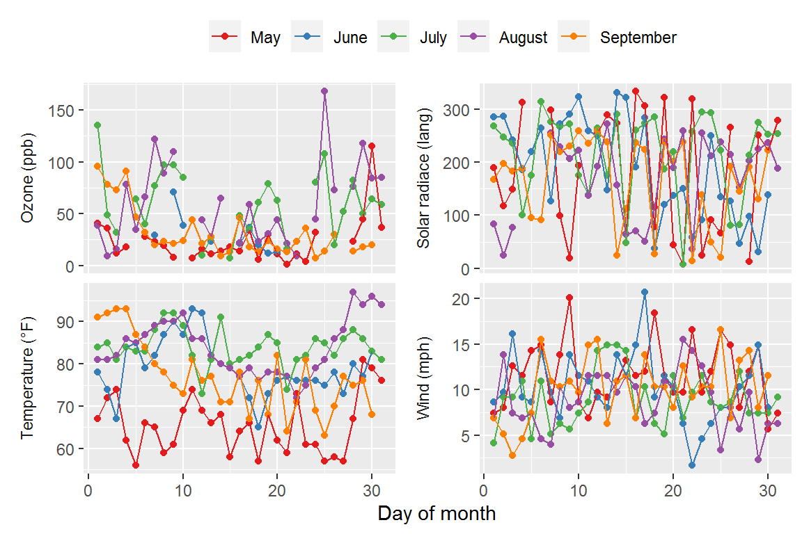
Hmm, the y-axes of the panels look fine, but what if we want to do something further (e.g., change the axis ranges or tick breaks)? Can we modify the axis scales for the individual facets to our heart’s content? Of course we can. Continue reading!
The solutions
Customizing the axis scales in ggplot facets is definitely not an easy task, and sometimes it requires a lot of trial and error. There are two ways you can do for it:
Method 1. Manual fix: adjusting the axis scales step by step Method 2. Quick fix: setting the axis scales using extension package
I’ll go through them in more detail in the following section.
Method 1. Manual fix
The basic idea of this method is to identify the individual facets and apply specific scale arguments to each of them. This method includes three main steps: (1) Adjust the limits, (2) Adjust the breaks, and (3) Adjust the labels.
Step (1) - Adjust the limits
We first start by extracting the current axis limits of each facet panel:
# Get a vector of the levels of the facet variable
var_names <- air_df$Env_vars %>% unique() %>% sort()

# Extract the limits of each facet panel
facet_lims <- map(1:4, function(x){
  lims <- ggplot_build(P_air)$layout$panel_scales_y[[x]]$range$range
  set_names(lims, c("Lower", "Upper"))
  }) %>%
  `names<-`(var_names) %>%
  bind_rows(.id = "Facet")

facet_lims
# A tibble: 4 x 3
  Facet   Lower Upper
  <chr>   <dbl> <dbl>
1 Ozone     1   168
2 Solar.R   7   334
3 Temp     56    97
4 Wind      1.7  20.7
Next, we will create a function using a series of if else statements to “gradually” identify the individual facet panels based on their current limits, and then set the new limits for each of them. This function will later be passed to the breaks = argument in scale_y_continuous() to draw new limits. (I know this is somewhat abstract; see the below code to get a better idea of how this works!)
Also note that in the if else statements, you can pick any number you like in the logical condition parts, as long as it can distinguish among the facets. For example, you can use max(x) < 50 or max(x) < 30 to identify the “Wind” panel. Though, I would suggest using the midpoint between the upper limits of the two “closest” panels to avoid potential errors (e.g., max(x) < 50 would be better than max(x) < 30 for distinguishing between “Wind” and “Temp” panel).
limits_fun <- function(x) {
  if (max(x) < 50) {  # This will identify the current "Wind" panel
    c(0, 30)  # New limits for the "Wind" panel
  } else if (max(x) < 150) {  # This will identify the current "Temp" panel
    c(40, 120)  # New limits for the "Temp" panel
  } else if (max(x) < 250) {  # This will identify the current "Ozone" panel
    c(0, 200)  # New limits for the "Ozone" panel
  } else {  # This will identify the current "Solar.R" panel (the "leftover" panel)
    c(0, 350)  # New limits for the "Solar.R" panel
  }
}

P_air + scale_y_continuous(limits = limits_fun)
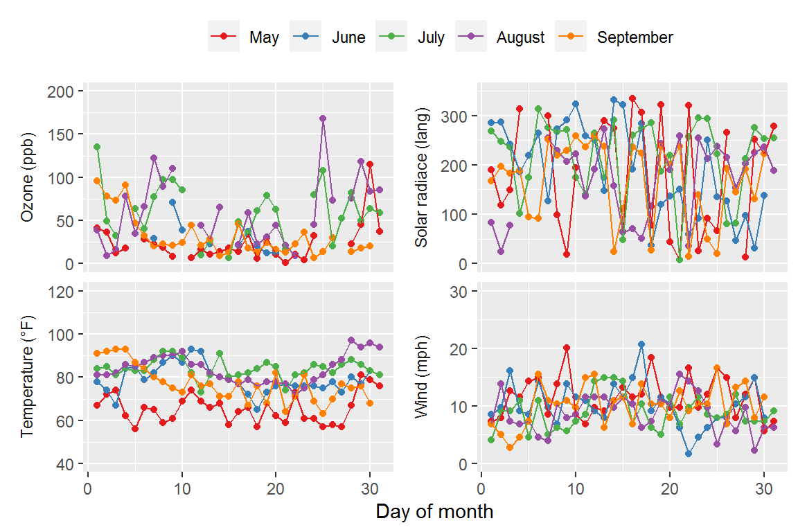
We have changed the axis limits, and now we will proceed to our second step: change the breaks.
Step 2. Change the breaks
Similar to what we’ve done in the first step, we will create another function, again using a series of if else statements, to “gradually” identify the individual facet panels based on their current tick breaks, and then set the new breaks for each of them.
breaks_fun <- function(x) {
  if (max(x) < 50) {
    seq(0, 30, 5)  # New tick breaks for the "Wind" panel
  } else if (max(x) < 150) {
    seq(40, 120, 20)  # New tick breaks for the "Temp" panel
  } else if (max(x) < 250) {
    seq(0, 200, 40)  # New tick breaks for the "Ozone" panel
  } else {
    seq(0, 350, 50)  # New tick breaks for the "Solar.R" panel
  }
}

P_air + scale_y_continuous(limits = limits_fun,
                           breaks = breaks_fun)
Step 3. Change the labels
This step is optional; if you’ve already set the new breaks, then the tick labels should automatically get set too. However, in some cases, you might want change the labels, and you can do it using the same principle as you used in the first two steps. Just make sure the numbers of labels you supply to each facet should match the numbers of tick breaks in that facet. (Here I’ll show you how to set new tick labels but just for demonstration purpose, and so the tick labels might not make any sense!)
labels_fun <- function(x) {
if (max(x) < 50) {
letters[1:7] # New tick labels for the "Wind" panel
} else if (max(x) < 150) {
letters[8:12] # New tick labels for the "Temp" panel
} else if (max(x) < 250) {
letters[13:18] # New tick labels for the "Ozone" panel
} else {
letters[19:26] # New tick labels for the "Solar.R" panel
}
}
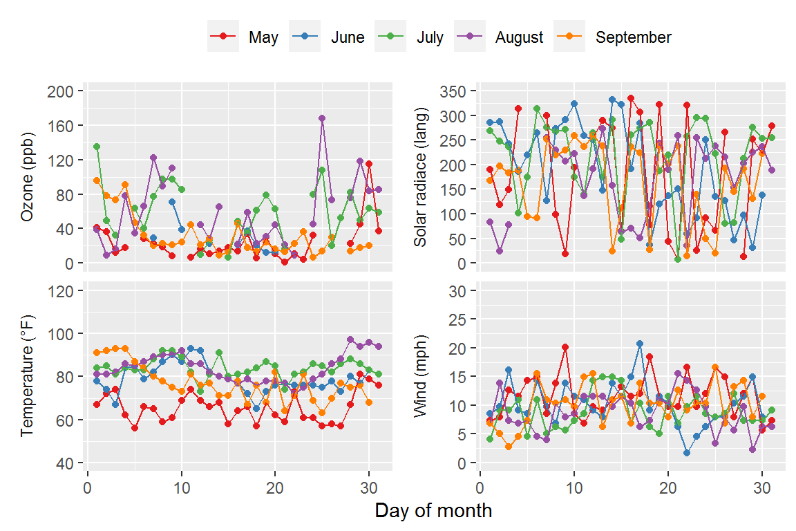
P_air + scale_y_continuous(limits = limits_fun,
breaks = breaks_fun,
labels = labels_fun)

This “manual” method is a bit tedious to be honest, but it does let you know how ggplot deals with the axis scales under the hood. However, who on earth would have the extra time to do this kind of manual adjustments? This is when the second method comes in handy!
(2) Quick fix
The package ggh4x has many nice functions for working with facets (you can install it from GitHub). Among these, the function facetted_pos_scales() allows users to directly set the scale arguments for each individual facets by name.
# devtools::install_github("teunbrand/ggh4x")
library(ggh4x)

P_air + facetted_pos_scales(
  y = list(Env_vars == "Ozone" ~ scale_y_continuous(limits = c(0, 200),
                                                    breaks = seq(0, 200, 40),
                                                    labels = letters[13:18]),
           Env_vars == "Solar.R" ~ scale_y_continuous(limits = c(0, 350),
                                                      breaks = seq(0, 350, 50),
                                                      labels = letters[19:26]),
           Env_vars == "Temp" ~ scale_y_continuous(limits = c(40, 120),
                                                   breaks = seq(40, 120, 20),
                                                   labels = letters[8:12]),
           Env_vars == "Wind" ~ scale_y_continuous(limits = c(0, 30),
                                                   breaks = seq(0, 30, 5),
                                                   labels = letters[1:7]))
      )

Done! Exact output. Easy-peasy!
Summary
In this post, we have walked through two ways to customize the axis scales for individual ggplot facets. Facets are really useful, but sometimes they’re also difficult to work with, and it really takes time to get your head around. Fortunately, there are many extension packages designed to make ggplots more user-friendly and versatile, and people in the R community have also been discussing all kinds of ggplot-related issues. Simply search on the net and you’ll find the solutions to your problems out there!
Hope this post helps and don’t forget to leave your comments and suggestions below if you have any!