Background
Pie charts are arguably one of the most fundamental graphs in the world. They are primarily used for presenting categorical variables with numerical values (values that can be converted to proportions). These charts are so simple and straightforward that almost everyone can grasp the information at first glance without thinking, thus quite useful for data exploration and communication (yet some have argued not to use them, especially in scientific publications. See this article for more details). That said, an ill-designed pie chart could still ruin your good data. So in this “cook” post, we will be looking at some ways to enhance your pie chart and make it more “attractive” and “effective”!
Basic pie charts with ggplot
To create a pie chart with ggplot, simply make a stacked barplot and add the function coord_polar(theta = "y"):
library(tidyverse)
# Data preparation: cars with different numbers of cylinders
n_cyl <- mtcars %>%
group_by(cyl) %>%
summarise(N = n()) %>%
mutate(cyl = as.factor(cyl))
# Basic pie chart
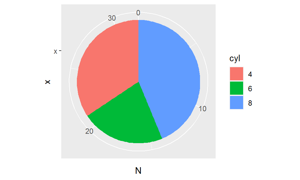
ggplot(n_cyl, aes(x = "x", y = N, fill = cyl)) +
geom_bar(stat = "identity", position = "stack") +
coord_polar(theta = "y")
You can also change the direction in which the categories/levels are ordered by specifying direction = -1 in coord_polar():
ggplot(n_cyl, aes(x = "x", y = N, fill = cyl)) +
  geom_bar(stat = "identity", position = "stack") +
  coord_polar(theta = "y", direction = -1)  # Counter-clockwise
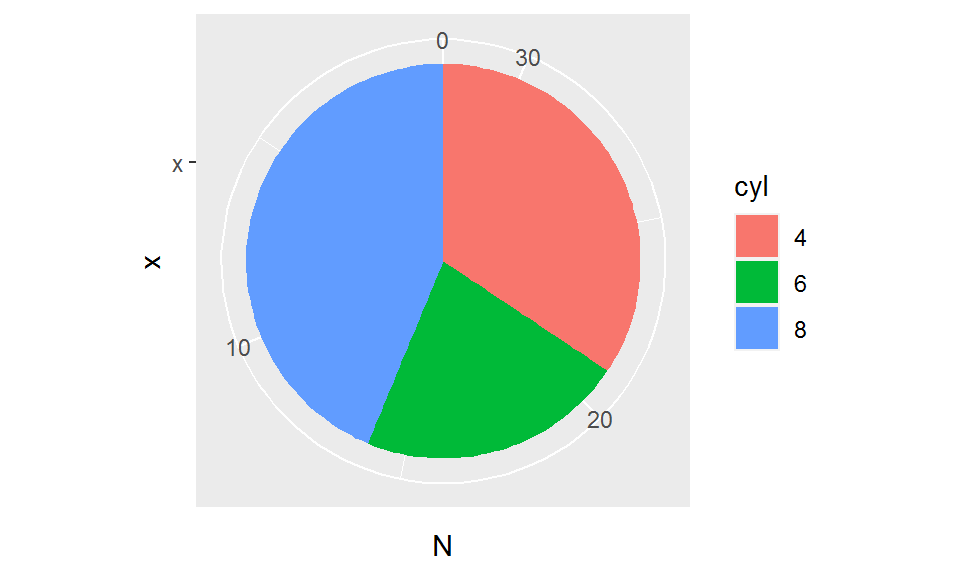
So what does theta = "y" do? Basically, this argument tells ggplot to map the y-axis to a polar coordinate system. The stacks in the barplot are bent into a circle, with the arc length of each slice proportional to the original heights of the stacks. Remember, pie charts are just circular stacked barplots!
More tweaks
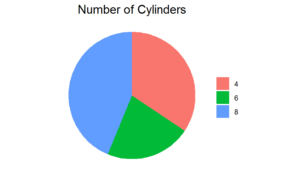
Recipe 1: clean up the pie
The above pie chart does not look satisfying. The axis tick marks and labels, grid lines, and the grey background are kind of extra, so let’s remove them. We will also add a title to the plot.
ggplot(n_cyl, aes(x = "x", y = N, fill = cyl)) +
  geom_bar(stat = "identity", position = "stack") +
  coord_polar(theta = "y", direction = -1) +
  scale_fill_discrete(name = NULL) +  # Remove legend title
  labs(title = "Number of Cylinders") +  # Add plot title
  theme_void() +  # Empty theme
  theme(plot.title = element_text(hjust = 0.5, size = 15))
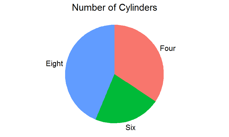
Recipe 2: label the pie
Sometimes you may want to directly label the slices rather than having a separate legend. Here is a trick: change the y axis tick labels to the names of the slices. We will compute the midpoints of the arcs (which are the positions at which the tick labels will be placed) and specify the label names in scale_y_continuous().
By the way, because the last factor level (in this example “cyl 8”) is at the bottom of the barplot and will go first in the pie chart, we need to reverse the order of the factor levels in our original dataframe to match the order of the stacks (slices) in the plot.
# Compute the midpoints of the arcs
label_pos <- n_cyl %>%
  arrange(desc(cyl)) %>%  # Reverse the order of the factor levels
  mutate(pos = cumsum(N) - N/2)

ggplot(n_cyl, aes(x = "x", y = N, fill = cyl)) +
  geom_bar(stat = "identity", position = "stack") +
  coord_polar(theta = "y", direction = -1, clip = "off") +
  scale_y_continuous(breaks = label_pos$pos, labels = c("Eight     ", "Six", "    Four")) +  # Add some white space to the labels to prevent overlapping
  scale_fill_discrete(name = NULL, guide = F) +
  labs(title = "Number of Cylinders") +
  theme_void() +
  theme(plot.title = element_text(hjust = 0.5, size = 15),
        axis.text.x = element_text(size = 12))
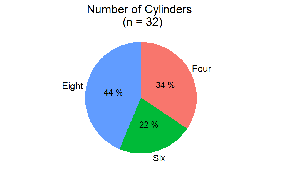
Recipe 3: annotate the pie
Additionally, you might want to annotate the slices, say for example, the proportions. We will create a new dataframe and use geom_text() to map the labels to the slices. The x positions are just an arbitrary “x” (same as the one in geom_bar()); the y positions are the midpoints of the arcs.
# A dataframe for mapping the labels to the slices
label_pos2 <- n_cyl %>%
  arrange(desc(cyl)) %>%
  mutate(pos = cumsum(N) - N/2,
         prop = paste(100*round(N/sum(N), 2), "%"))

ggplot(n_cyl, aes(x = "x", y = N, fill = cyl)) +
  geom_bar(stat = "identity", position = "stack") +
  geom_text(data = label_pos2, aes(x = "x", y = pos, label = prop)) +
  coord_polar(theta = "y", direction = -1, clip = "off") +
  scale_y_continuous(breaks = label_pos2$pos, labels = c("Eight     ", "Six", "    Four")) +
  scale_fill_discrete(name = NULL, guide = F) +
  labs(title = "Number of Cylinders \n (n = 32)") +
  theme_void() +
  theme(plot.title = element_text(hjust = 0.5, size = 15),
        axis.text.x = element_text(size = 12))

An even simpler alternative is to map the labels to the stacks using geom_text() and center-align their vertical positions by specifying the argument position_stack(vjust = 0.5):
n_cyl2 <- n_cyl %>%
  arrange(desc(cyl)) %>%
  mutate(pos = cumsum(N) - N/2,
         prop = paste(100*round(N/sum(N), 2), "%"))

ggplot(n_cyl2, aes(x = "x", y = N, fill = cyl)) +
  geom_bar(stat = "identity", position = "stack") +
  geom_text(aes(label = prop), position = position_stack(vjust = 0.5)) +  # Center-align the vertical positions of the labels on each stack
  coord_polar(theta = "y", direction = -1, clip = "off") +
  scale_y_continuous(breaks = n_cyl2$pos, labels = c("Eight     ", "Six", "    Four")) +
  scale_fill_discrete(name = NULL, guide = F) +
  labs(title = "Number of Cylinders \n (n = 32)") +
  theme_void() +
  theme(plot.title = element_text(hjust = 0.5, size = 15),
        axis.text.x = element_text(size = 12))
Looks way better than the previous ones, doesn’t it?
Different varieties of pies
Now that we have already learned how to bake a basic pie, let’s take a look at some other pie varieties:
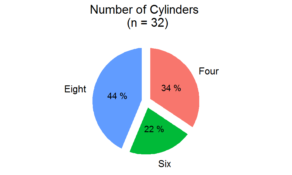
1. Exploded pie chart:
In an exploded pie chart, the slices are split apart from each other. You can “cut” the slices by adding thick white borders around them (personally I feel that this is more visually appealing than the original “unexploded” one).
label_pos2 <- n_cyl %>%
  arrange(desc(cyl)) %>%
  mutate(cumsum = cumsum(N),
         mid = N/2,
         pos = cumsum - mid,
         prop = paste(100*round(N/sum(N), 2), "%"))

ggplot(n_cyl, aes(x = "x", y = N, fill = cyl)) +
  geom_bar(stat = "identity", position = "stack", color = "white", size = 5) +  # Add white borders around the slices
  geom_text(data = label_pos2, aes(x = "x", y = pos, label = prop)) +
  coord_polar(theta = "y", direction = -1, clip = "off") +
  scale_y_continuous(breaks = label_pos$pos, labels = c("Eight     ", "Six", "    Four")) +
  scale_fill_discrete(name = NULL, guide = F) +
  labs(title = "Number of Cylinders \n (n = 32)") +
  theme_void() +
  theme(plot.title = element_text(hjust = 0.5, size = 15),
        axis.text.x = element_text(size = 12))
2. Doughnut chart:
Have you ever seen a pie chart with its center hollowed out? This is called a “Doughnut chart” (yes, from a “pie” to a “doughnut”)! There is no direct function or argument to create a doughnut chart in ggplot, and so we will use a small trick here: add an arbitrary “empty” level to the x-axis before the one we have. This works because there is nothing to be bent into a circle for that empty level, thus leaving a white area and forming a hollow there. We can use scale_x_discrete(limits = c("x_empty", "x")) to add an arbitrary level “x_empty” to the x-axis.
label_pos <- n_cyl %>%
  arrange(desc(cyl)) %>%
  mutate(cumsum = cumsum(N),
         mid = N/2,
         pos = cumsum - mid)

ggplot(n_cyl, aes(x = "x", y = N, fill = cyl)) +
  geom_bar(stat = "identity", position = "stack", width = 0.7) +
  scale_x_discrete(limits = c("x_empty", "x")) +
  coord_polar(theta = "y", direction = -1, clip = "off") +
  scale_y_continuous(breaks = label_pos$pos, labels = c("Eight     ", "Six", "    Four")) +
  scale_fill_discrete(name = NULL, guide = F) +
  labs(title = "Number of Cylinders") +
  theme_void() +
  theme(plot.title = element_text(hjust = 0.5, size = 15),
        axis.text.x = element_text(size = 12))
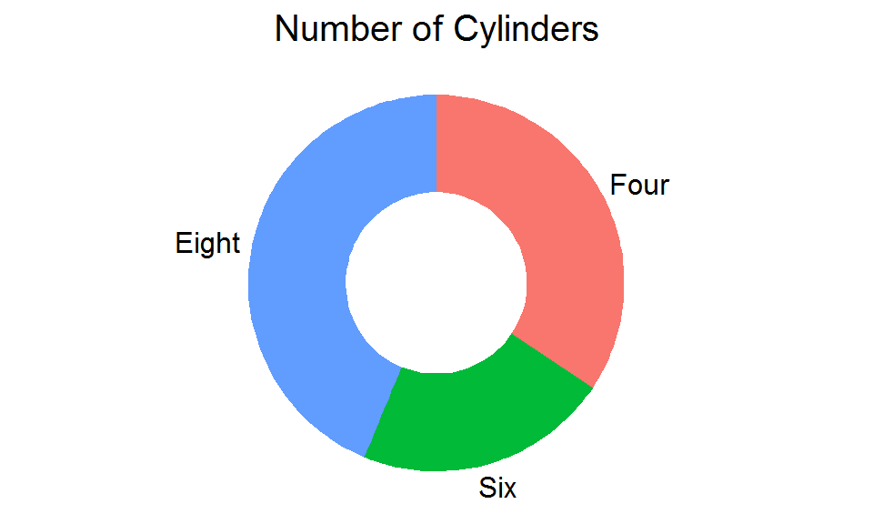
Notes:
In this example, I call the empty level “x_empty”. You can use whatever name you want; just make sure it is not the same as your original one.
The empty level should be added BEFORE the original level (limits = c("x_empty", "x")), not after (limits = c("x", "x_empty")). Otherwise, the white area will be left outside the pie instead of inside it.
The “thickness” of the doughnut can be controlled by the argument width = in geom_bar().
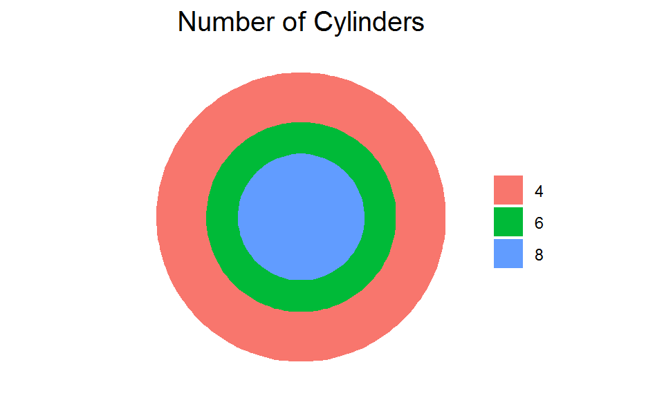
3. Bull’s eye chart:
What happens if you call theta = "x" instead of theta = "y" in coord_polar()? This will give you a chart with concentric circles, also known as “Bull’s eye chart”. Be careful though, this kind of chart could be a bit misleading, as the areas of the circles/rings are not proportional to the original values.
ggplot(n_cyl, aes(x = "x", y = N, fill = cyl)) +
  geom_bar(stat = "identity", position = "stack", width = 1) +
  coord_polar(theta = "x", direction = -1, clip = "off") +
  scale_fill_discrete(name = NULL) +
  labs(title = "Number of Cylinders") +
  theme_void() +
  theme(plot.title = element_text(hjust = 0.5, size = 15))
Summary
At this point, you should have got the hang of creating pie charts with ggplot. As you can see, this type of graph is best for visualizing categorical variables with numerical values. However, it becomes less effective when there are too many categories (slices). In general, the number of categories should be less than 7 to achieve a better visual effect (though it really depends on the nature of your data). Also, when you are comparing the slices across multiple pies, it can sometimes be visually deceptive since the angle of the slice represents the “proportion” rather than the original “absolute value”. In these cases, a regular barplot or a boxplot would be a better alternative.
Hope you learn something and will be able to make a “tasty” pie chart yourself. And as always, don’t forget to leave your comments and suggestions below if you have any!